The headline of this post is a quote borrowed from the Canadian author Witold Rybczynski who when asked by the New York Times what the greatest invention over the past millennium was, responded that it was the screwdriver (I would have chosen computer - by I'm not very good with home renovations), and went on to say that the Robertson screwdriver in particular was the "biggest little invention" over the past 100 years.
If you live outside Canada, or do not often handle with screws you may never have heard of the Robertson screwdriver or the story behind it. I will get into the details of that story near the bottom of this post. But for now all you need to know is that the Robertson screwdriver is widely used in Canada and only just recently is picking up traction in the US, even after being on the market for over 100 years. This is very odd since the Robertson screwdriver does the job of screwing much better than other screwdriver out there.
Qlik I would say does a better job at analytics than any other tool out there, but like the Robertson has also failed to take over the world (or at least its underlying innovation), which is also very odd.
I believe the reason for this can be summed up as a lack of connoisseurship. Most people cannot concisely explain what analytics is or how it differs from related concepts like statistics and 'data science'.
Analytics is in essence a game of '20 questions', an endless stream of why why why, which can be boiled down to yes/no questions. While most analytic tools allow the analyst to interactively see the 'yes' answer to any given question, only Qlik's Associative Index allows the analyst to get to the 'no' answer. This allows the analyst to keep asking questions without having to pivot to Data Wrangling and Data Prep work, and may thus sustain a "flow" state of mind.
It is for this reason I see Qlik's Associative Index like the Robertson screwdriver: They were both purpose built for their task, more so than the competitor's offering. Why is it then that both of these tools have not done better?
At this point you might be a bit confused. I hope by the end of this article this will make a bit more sense to you, and in the process I also hope to share with you how I have come to understand the meaning and essence of what "analytics" actually is.
This is the third and final post on this topic. In this post I wish to discuss three sub-topics:
- What history can teach us about the nature of tools
- The psychology of analytics – as I have seen it and experienced it
- How #1 and #2 can be understood through lens of Power BI vs. Qlik
What History Can Teach Us About the Nature of Tools
I have published this as a standalone article here.
Later in this post I will elaborate on my analogy to screwdrivers, but if you read this other article I published a few weeks back I hope to also convince you of how Qlik is more like “Wordstar” and the “mongolian horse” whereas Power BI is more like the “MS Word” and the “European horse”, respectively.
The Psychology of Analytics – In My Travels
Harkening back to the first article in this series, I explained how I see Analytics as a game of twenty questions -or even a debate - that continually feeds back on itself: You ask a question which provides an answer that leads to another question and another answer and so on until you see no point in asking more questions. Is there a pattern to these questions that can help us choose a tool that fits these patterns?
The overarching pattern in analytics is that when asking and answering questions, we are constantly making comparisons to find what we’re looking for. The syllogism itself – which underpins analytical thinking - is the process of comparing the Major Premise (e.g. ‘All persons are mortal.’) to the Minor Premise (e.g. ‘Socrates is a person’) and comparing the two premises based on their middle term (e.g. ‘Person’) to see if they connect to trigger the conclusion. All questions can be boiled down to ‘Yes’ or ‘No’ (this is known as the “law of excluded middle” in the so-called “laws of thought”). All computer code basically works like this.
However, unlike computer code – which tends to follow the logical trajectory of “true” statements, while usually ignoring false or negative conditions – analytics is equally concerned with the negative outcomes as positive ones.
The game of “20 Questions” is played out by making a series of comparisons where both the positive and negative answers guide us. Business Analytics is no different.
Is there a pattern to the types of comparisons people make?
I have observed and participated in hundreds of analytical exercises – everything from quick ad hoc reporting to working alongside statisticians, to building predictive analytics systems, to building enterprise data warehouses – and having observed the types of questions business decision makers ask and answer (how they play the game of Analytics), I believe there are two main patterns which stand out which and are important to understand.
These two main analytical patterns roughly align with management level:
First, the “Drill-down and Compare” or simply “Drill” pattern: Managers and above are generally interested in making comparisons between aggregates. Typically, a manager will start with the “big rocks” (e.g. Total Revenue) and then begin drilling down by whatever dimension (e.g. time, location, product category, etc.). When drilling down, the user is making comparisons between groupings. These comparisons are typically visualized in bar charts, line charts for trending, or pie or treemap charts for share-of-total. Most analytics at this level is concerned with either finding outliers (e.g. a spike in sales for a given date) and then drilling down to the details to learn more, but this may require a hand-off to other analysts which we will discuss in a moment.
Managers are also interested in patterns, especially trends over time. Most of the time the manager analyst just wants to know that everything is running as usual – like a heartbeat monitor. If they look at the same report on a regular cadence (e.g. monthly) and they will grow accustomed to how charts should appear so if there is shift to the pattern, they will notice this and begin asking follow-up questions. These follow-up questions often get handed over to other analysts.
Managers and directors are for this reason fond of interactive dashboards and self-serve reports, and this is where most money is spent with respect to Business Analytics and Data Warehousing. Tools like Power BI, Qlik, and Tableau, not to mention underlying data warehousing and data prep tools from vendors like Oracle, Amazon, Google, Informatica, Databricks, Cloudera, TeraData, Microsoft and so forth. This BI+DW (Business Intelligence + Data Warehouse) spending accounts for a significant percentage of overall IT spend.
While managers and directors appreciate interactive dashboards, executives and board members on the other hand often prefer more digested insights. People working at this level expect all questions to already be answered. If there is an outlier or pattern anomaly the report will usually provide an explanation upfront. Tools used to provide these types of reports are often just presentation tools like MS PowerPoint or graphic design tools like Adobe Photoshop. The costs associated with these reports are mostly on the human resources who develop these custom reports and infographics. Analytics at this level ultimately plays out in an executive board room with a presentation followed by a dialectic discussion and possibly debate.
Getting back to managers and directors, this is where most money is spent on analytical tools. But as mentioned above managers will routinely find outliers and pattern anomalies through a “Drill-down” analysis. But uncovering the deeper reason for the anomaly or change in pattern requires shifting gears. Managers will often either hand-off the follow-up questions to other analysts or they themselves will switch gears and begin using… Excel.
Recalling our game of ‘twenty questions’, most tools do well when the answer to a question is ‘yes’, since we can keep drilling down into that selection. But when the answer is ‘no’ most of these tools run into a problem because they are not designed to examine the excluded values or ‘negative space’ as it were.
What is negative space?
The poet
John Keats coined a similar term “
Negative Capability” to describe negative space as a source of mystique and wonder that poets and artists could explore and contemplate, often romantically.
In the world of science, filling negative space drives all endeavours. It is the reason you keep hearing about “dark matter” and “dark energy” and why we are reminded that Einstein’s theory of relativity must ultimately be false (but like Newton's laws, is still useful).
Fortunately, however, the material nature of most organizations is recorded in structured datasets. These datasets are are finite and therefore it is physically possible to probe the ‘negative space’ when asking questions. However, most analytical tools – and data warehouses - are not purpose built for designed for this task. This means that humans are doing most of this work.
This brings me to the second pattern, the “Contrast and Compare” or simply “Contrast” pattern: The Contrast pattern normally occurs following the Drill pattern and is concerned with exploring and contrasting negative space. The Contrast pattern tends to follow one or both processes:
- Isolate relevant sub-population (e.g. Toronto and Ottawa) within parent grouping (e.g. Ontario)
- Contrast sub-population to their complement: e.g. Average Home Price in Ottawa + Toronto vs. rest of Ontario
- Allows us to see the difference between housing prices in urban metropolitan regions versus rest of Ontario
OR:
- Take two populations (e.g. Rentals during winter versus rentals during summer)
- Determine what is in the first population that is not in the second and vice versa
- Allows us to appropriately target summer-only customers or winter-only customers or all-season customers with specific and relevant ad campaigns
When it is easy to isolate sub-populations by simply filtering on a small number of fields then we need not go beyond the “Drill” pattern and many analysts may use dashboards in this way. Although they will only be able to see differences in the aggregations (e.g. total number of sales by Month) but this can still be revealing. For example, a telecom analyst who suspects that outdoor weather precipitation (e.g. rain) might be causing a spike in call volumes might filter on all the known dates over past 12 months it rained or snowed. The analyst would then filter on the compliment – all days where it did NOT rain or snow - and then compare these sub-populations with respect to standard measures like Call Volume and Average Handle Time to understand the differences the change in weather pattern might generate. The answers to these questions could lead to cost saving improvements in staffing and revenue generating improvements in sales.
Another common variant of the “Contrast” pattern is when the analyst is handed two sets of data and simply told to find the deltas and then report on those deltas based on a of comparison key. For example, an analyst might be given two lists: A list of customers from ten years ago and a list of customers from present-day today. The analyst might be asked to produce a report comparing the loyal customers who appear on both lists to newer customers who are only on the present-day list to the previous customers who have since left. The report could lead to a reduction of costly customer “churn”.
There is another word – “Parallax” – that also describes this pattern. In optics, the parallax effect is when an object that is nearer to us tends to move faster than an object that is far away. By exploiting this property, it is possible to measure the distance between distant objects without traveling those distances. The philosopher/comedian Slavoj Žižek uses the word parallax to explain how “truth” can only be teased out through the types of comparisons that reveal differences. More practically, when we are making assessments about the world, like reading the news or researching a new car or other big-ticket purchase, we are attempting to find contradictions between perspectives and distill from these contradictions what is going on. For example, we might read some good reviews of a new TV and then one or two bad reviews and by focusing on the differences we might find out that the good reviewer overlooked something that the bad reviewer complained about, and we might go on see that the bad review was simply complaining about a bad installation experience they had. Or maybe the good reviewer only cared about price and was not attuned to picture quality as the bad reviewer. It is from these contradictions, this parallax effect, this contrast, that we can uncover useful insights.
While this yes/no approach might seem binary or simplistic, and to be sure Analytics can be wielded cynically (as it all too often is), but with enough questions you can begin to see a spectrum and other patterns emerging. With enough questions deep insights and epiphanies begin to emerge.
The visual that comes to mind for the Contrast pattern is the Venn diagram, but the Contrast process tends to be table-centric because the analyst is mostly relying on either Excel or a possibly a Data Prep tool like SQL, Python, Power Query, or Alteryx to perform the detailed comparisons between sets.
What we see then is analysts spending most of their time in Data Prep tools (especially Excel) pulling sub-populations through either delta comparisons (often using the ‘VLOOKUP’ function in Excel) or by filtering on subsets of data and then using a delta comparison (again using VLOOKUP) to extract the compliment of the sub-population they were filtering on (e.g. the compliment of all dates there were precipitation).
Most Data Prep in the business world is done using Excel using the VLOOKUP function, but much of it is done in SQL as well using the NOT EXISTS or NOT IN clause. Data Prep can also be done in more business-friendly date prep tools like Power Query (built into Power BI) which has an “anti-join” operation as part of its “merge” step.
It should be pointed out though that Data Prep is essentially programming and requires a shift in thinking. When doing Data Prep the analyst/developer can certainly enter a flow state, but they are no longer in the Analytical flow state playing 20 questions. Instead their mind is in the world of syntax and code structure – even using the VLOOKUP may require a reorganization of columns which can be time consuming and distracting.
An analogy I use to explain the relationship between Data Prep (which is more like programming) and Analytics (which is more like a game of 20 questions) is based on this quote from Abraham Lincoln: “If you give me six hours to chop down a tree I will spend four hours sharpening my axe.” You can think of Data Prep as axe sharpening and analytics as wood chopping. The ratio of 2:1 between Data Prep and Analytics would not be bad, but what I see is something closer to 5:1 or even 10:1. Ideally, we want to be spending more of our time chopping and less of it sharpening if possible. The reasons are that with pure analysis (chopping) you can more easily achieve a flow state while also collaborating with others. Data Prep (sharpening) on the other hand is a more solitary activity and while you can attain a flow state your focus is directed at answering technical rather than business questions.
This is the reason Qlik stands out, because it is possible to contrast data sets interactively and this is because Qlik’s indexing technology – the Associative Engine – was built from the ground up to support the selection of excluded values. With every other Business Intelligence tool I have used, negative values are an afterthought and not easily accessed.
Using our example from above, if we want to compare days with precipitation to days where there was no precipitation in Qlik we can interactively select the complement of dates, we can even restrict our complement to be within a given subset (e.g. for a given year and region). From here we can contrast customer patterns for days when there was precipitation to days where there was not.
Furthermore, QlikView (not Qlik Sense unfortunately) allows users to save the subset of data that has been selected. This means that after selecting days with precipitation (or we could choose no precipitation), we can then reduce the dataset to what is associated to those dates. From there we could choose another dimension – say “temperature” - to partition the data by in order and inspect that contrast. This would allow us to see the contrast of above freezing or below freezing to see if a pattern emerges. We could then go back up a level to the original dataset and segregate the original dataset using temperature to see if the same patterns hold as when contrasting within the precipitation subset.
By contrasting these patterns with respect to precipitation and temperature, as an analyst we can begin to see the relationship between these dimensions and other dimensions. Depending on what differences emerge between the subsets, we can choose to partition, contrast, and then take a subsequent subset. We can keep playing this game of twenty questions until we have answered our questions or at least satisfied our curiousity.
Alternatively, if we want to compare multiple Customer lists to see what customers are only in one and not in another, we can do so interactively, and again we can easily isolate subsets of customers and compare them looking for patterns.
It is of course possible to accomplish any of these tasks using other tools like Excel or Power BI (via Power Query) or SQL or Python, but one cannot do so interactively.
I should point out that it is also necessary while performing a “Contrast and compare” activity that on some occasions going back and “sharpening the axe” through Data Prep is required. But in many circumstances this is not necessary, and if the data has been well prepped you can ask and answer many questions interactively by leveraging the “excluded values” supported by Qlik’ Associative Index.
In my own experience I have leveraged this power to significant effect and there have been occasions where I was able to sustain a “flow state” for up to an hour of constant Q&A through a series of dimension selections, because I was able to easily contrast selections to one another and see what was exposed and what was hidden by doing so. On these occasions I would often find “needles in haystacks” and the feeling was not unlike debugging a computer program, but I felt like was debugging the business. And debug I did. Some of these insights did lead to noticeable changes in how the business was run.
Taking the two patterns together – “Drill” pattern and “Contrast” pattern – there is an analogy that I find quite useful for thinking of these as part of a cycle.
Namely, there is a concept known as the
OODA loop (credit goes to
Alistair Croll for introducing me to this) which was developed by a US Air Force Colonel
John Boyd. The OODA loop was developed by Boyd for the purpose of fighter jet combat. Boyd realized that the rules of combat had changed with heavy supersonic jets and that a different mode of thinking was required to use them effectively in combat.
OODA stands for:
In the context of fighter jet combat the pilot might “observe” an opponent and then instead of engaging them in the moment would begin “orienting” their plane and mindset such that the pilot has the best available information to “decide” and “act”. The decision might be to attack or just as likely to move to another defensive position. If the pilot moves to a new position, they would repeat the OODA loop cycle until either defeating the opponent or retreating.
The most important step in the OODA loop – and what distinguishes it from other business cycles like the “plan-do-check-act” lifecycle is the emphasis on orientation. It is the “orientation” step that brings to bear the subjective experience and talents of the pilot to maximize their strength.
Relating this back to the Analytics patterns I described above I see the “Drill” pattern as like the “Observe” step and the “Contrast” pattern similar to the “Orient” step.
It stands to reason that if we can make the Orient step more efficient – which is the bottleneck of the OODA loop – then we can make analytics more efficient.
There was another tidbit of wisdom that Alistair Croll also mentioned when discussing the OODA loop which relates back to my earlier points regarding horses and word processors: Once you cross a threshold of efficiency the game itself can begin to change.
The example Croll used was the steam engine that James Watt invented. Watt’s new steam engine, design developed in the late 1700s, is generally regarded as one of the key factors that catalyzed the industrial revolution during the 19th century. However, when it was first introduced some people speculated that it would cause a depression for coal miners because only a quarter of the coal was required to produce the same amount of “horse power” (a unit of measure that Watt also invented). Instead, because the Watt’s steam engine had crossed an efficiency threshold it could be used for all sorts of businesses that otherwise would not be able to afford the cost. As a result coal mining began to boom like never before.
The rest as they say is history.
Difference Between Qlik and Power BI and Excel When Contrasting Data
In this section I will be contrasting the tools themselves to show how they differ when used to contrast data.
In this example we will continue with the Call Centre data, although I have created a new fictional dataset with more attributes to compare.
Differences in Qlik, Power BI, and Excel Explained
The main difference between Qlik and Power BI when it comes to contrasting data is this:
Qlik can be more efficient for the user than Power BI (or Excel) for contrasting data because Qlik allows the user to contrast data sets interactively by clicking buttons which can be performed while in a “
flow” state of consciousness and focus on the business questions.
Power BI on the other hand can do some of this under some circumstances but in other circumstances requires the user to build new charts and in some cases it may require a change to the data model itself. Because different types of solutions may be required – some taking longer than others – it’s harder to achieve a “flow” state of consciousness while playing the game of 20 questions.
Excel – through the VLOOKUP function - is more consistent in its approach to reconciliation than Power BI although it requires the Excel user to effectively perform some basic Data Prep. Because of this consistency users can get into a “flow” state and focus on business questions, but unlike with Qlik – which keeps the analyst in a Business Analytics flow state - Excel forces data analyst down to a Data Prep flow state, distracting from our game of 20 questions.
Let’s first explore these differences between tools using a very simple example and then move to a more realistic example in the next section.
For each of these demos we are comparing two lists [of calls] to the difference between the two sets. We are using two pairs of datasets for this:
- Related one-to-one
- Related many-to-many
Let’s see how the “contrast” exercise appears for each tool, starting with Qlik then Power BI and finally Excel.
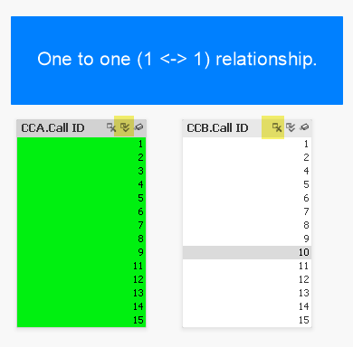
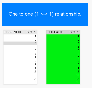
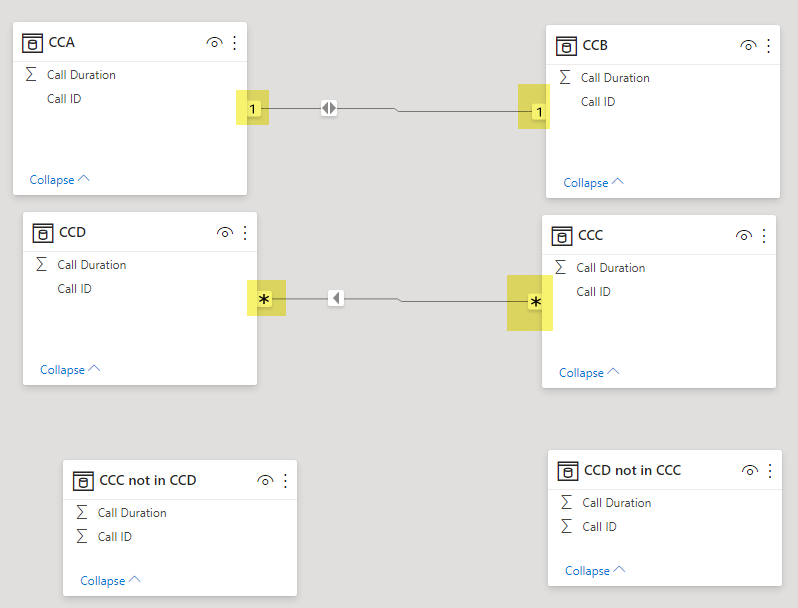
In this example with Qlik need only click the “select all” icon (highlighted in yellow) as denoted by the double-checkmark icon. Doing so instantly reveals excluded values (3 missing from CCA and 3 missing from CCB).
If the lists were not so compact and instead had thousands (or millions) of values, we could click the “select excluded” button to instantly see the excluded values. Furthermore we could simply select these excluded values to explore their distribution with respect to other metrics.
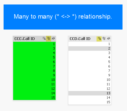
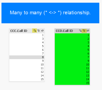
The following screen caps show that there is no difference with the relationship is many-to-many:
As you can see there is no difference in behaviour. The user doesn’t have to think and can follow the same “happy path”.
Although it is not necessary in this example, if we wanted to analyze the subset of calls that are excluded, in QlikView we can perform a “reduction” which effectively removes everything else except for our selections. The screen cap below shows how this option is selected and how the data appears following selection.
Here is how it appears.
Now let’s see how this compares with Excel.
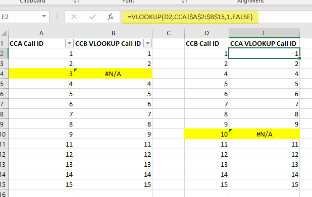
We use the VLOOKUP function which performs a lookup against another table and then retrieves a corresponding row value based on a match with the key column value.
Here is how we have implemented the function as used in the screencaps below:
=VLOOKUP(A4,CCB!$A$2:$B$15,1, FALSE)
This shows how the one-to-one linked tables appear when contrasted in Excel using the VLOOKUP function:
Here we go again with the many-to-many example:
Speaking for myself, I do not find the function intuitive to use and if I haven’t used it for a while will forget to hit ‘F4’ to make the second argument absolute so that it does not change from row to row when you auto-fill the cells below. But most Excel jockeys have no problem with these quirks and can wield it relatively quickly. Given the initial difficulty with VLOOKUP and how popular it is, I’ve often thought of VLOOKUP as a kind of analytical rite-of-passage.
Regardless of how proficient you are performing a VLOOKUP, it is essentially a Data Prep task and you may need to reorganize the column order in the data itself before you can begin to use the VLOOKUP function in order to place the key field in the correct column order.
With Qlik the user can interactively select excluded records with a single click (or maybe 2 at most) thereby reserving one’s capacitive memory (we can keep track of about 7 things in our head at once – known as Miller’s magic number). This allows the user to focus on allowing business questions to guide selections (including selecting excluded calls) allowing for a “flow” state of consciousness thus enabling optimal human performance.
Contrast this with Excel where the user must change gears and switch into Data Prep mode – even if only for a few seconds – this breaks the steam of consciousness pertaining to the business questions and forces the analyst to context switch to a Data Prep exercise. If the Excel analyst is practiced and quick and can complete the VLOOKUP in under 10 seconds, then they can maintain their train of thought then they may be able to return to a flow state. But every VLOOKUP and Data Prep task potentially breaks this flow and thus undermines the desired flow state.
While the Qlik and Excel approaches are quite different in that Qlik can perform the task interactively maintaining business question-mode thinking whereas Excel requires changing gears into Data Prep-mode thinking, but what they both have in common that they do not share with Power BI is consistency. Namely, regardless of the data cardinality, whether the data is linked one-to-one or one-to-many or many-to-many, the operations the analyst performs are the same. It is this consistency in Excel that allows an experienced user to almost work subconsciously when performing the Data Prep tasks thus keeping the train of thought on the business questions.
Having seen Qlik and Excel, let’s move to our third and final example: Power BI.
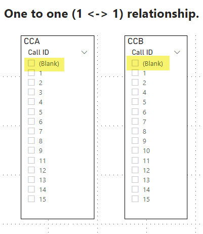
The two screen caps below show two pairs of Power BI Slicers respectively. The screencap showing the first pair show how they appear without user selections.
In the second screencap, we can see what happens when the user selects ‘(Blank)’: Power BI reveals the missing Call IDs from the other table.
In this example we can see the user need only click ‘(Blank)’ to see the missing values. In Power BI, any time there is a one-to-one or one-to-many relationship defined, the user can always click ‘(blank)’ on the “one” side to see the missing values on the other side. Just like in Qlik the user need only click a single button to reveal the deltas.
The one-to-one example is very similar to Qlik and can be performed with a single click, thus enabling the desired “flow” state of consciousness.
But what if the relationship is one-to-many or many-to-many? The differences between the relationships are shown below.
Due to the nature of Power BI’s Vertipaq indexing engine, columns that are in a table on the “many” side of any relationship will not allow users to simple select ‘(Blank)’ as we saw in the example above. Instead, the user must develop a Table Chart and configure it to show blank values.
The example shown below shows the delta between the two lists by building a simple Table Chart and then sorting the smallest values to the top to see the deltas (highlighted). You can also see that the Slicers no longer have the option of selecting ‘(Blank)’.
As noted above this chart requires an extra step of configuration that is normally not required: I had to check the “Show Items with No Data” option.
Reflecting on this we can see that for the many-to-many relationship it is a different and more complicated process we need to follow when reconciling across relationships that have a “many” sided cardinality on one or both sides.
It should also be pointed out that it makes no difference if the link direction is Both or Single direction or which direction the link is pointing since the only way to answer must be calculated through a chart that we must build that requires a more time-consuming dense calculation - by explicitly evaluating all possible combinations - as opposed to a quick sparse calculation like when we selected ‘(Blank)’ in the earlier example. Qlik on the other hand is only making quick sparse calculations as it leverages its Bi-directional Associative Index (BAI) to directly pinpoint deltas. This performance hit in Power BI adds another level of friction when it comes to reconciliations. But the main difference between the tools is that Qlik provides a consistent, quick, and interactive reconciliation experience whereas Power BI requires changing gears to build tables, and then waiting additional time for those densely calculated tables to render.
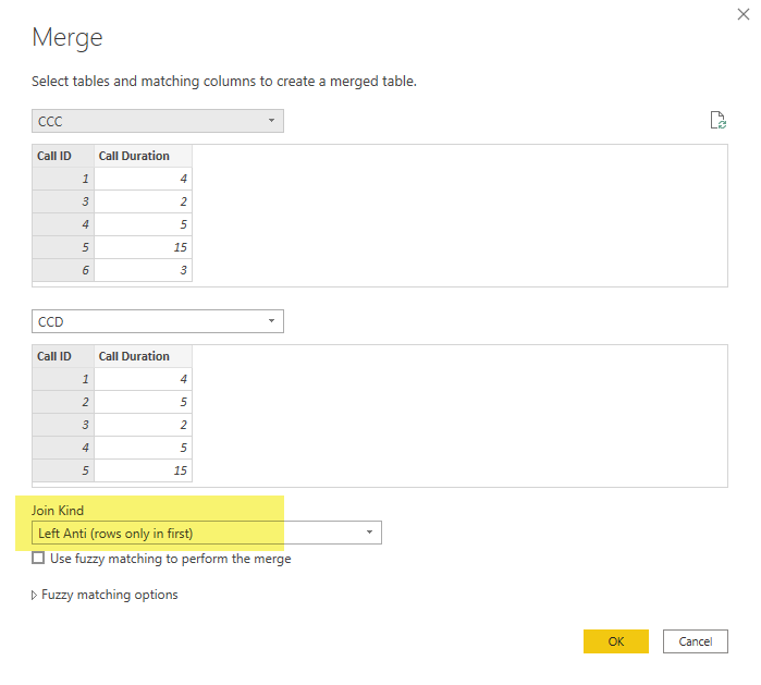
There is another approach we can take with Power BI: If we look to Power BI’s built-in Data Prep tool Power Query, here we can see a more consistent “
happy path” to reconciliation much like Excel.
Namely, we can use Power Query’s
ANTI-JOIN feature which can be accessed through the “Merge” step with the Join Kind set to ‘Left Anti (rows only in first)’ as shown below.
After completing both a ‘left anti’ and ‘right anti’, the screencap below shows the resulting delta datasets that were correctly revealed.
As it turns out this ANTI-JOIN approach is closer to a ‘happy path’ due to its consistency in procedure – since the cardinality and link direction of relationships is irrelevant - rather than through navigating Slicers and Tables in a pre-built Tabular Model and performing different operations depending on the cardinality of relationships. Furthermore, this approach to reconciliation can be easily automated and the resulting data can be selected and analyzed by the user. This is like how a Qlik user can “Select Excluded” values and analyze the compliment set.
Thus, if your focus is on contrasting data and you need a surefire tool, it is better to use the Power Query within Power BI as opposed to Power BI proper.
In summary, the name of the game is not only to meet business requirements (any Turing-complete software can do that), but rather the game of Analytics should be about putting the user in a “20 questions” flow state of consciousness for efficient business problem solving.
Both Excel and Power Query do provide a “happy path” when it comes to contrasting data, but that happy path requires context shifting from business analytical thinking to Data Prep tool thinking. Qlik on the other hand is well designed to perform interactive reconciliations at a record level and with some training users can achieve a flow state of consciousness.
In the next and final section, we will compare Qlik and Power BI using a more realistic example.
Data and App Documents
Here is the
data we used. It also includes the Excel VLOOKUP examples.
Here is the QlikView application
document.
Here is the Power BI application
document.
Differences in Qlik and Power BI in Practice
In this example we will analyze a telecom’s (e.g. Bell, Rogers, AT&T, Sprint, etc.) Call Centre data in order to answer the question: During February 2020 which Customers placed calls to the Call Centre answered by non-authorized Customer Service Representative and did not generate any Work Orders?
We can break this question down into a series of yes/no questions:
Question: Did the customer place a call in February 2020?
Answer: Yes.
Question: Was there an authorized Call Centre Representative on this call?
Answer: No.
Question: Does the call have an associated Work Order?
Answer: No.
With Qlik and Power BI we can ask these questions for our entire population of linked customers, calls, and work orders.
With Qlik we can answer these questions quickly and interactively while maintaining a “flow” state of mind, but with Power BI we must change gears and build and configure dense pivot tables which leads to mental context switching.
Before getting into the heart of this example I should point out that I am using fictional data that I generated using a normal random number generator. This data set lacks the novelty we find in the real world. I must apologize that the “insights” revealed are not on the level we would get from a real-world data set. However, there is also a lesson here: Publicly available data sets tend to be relatively simple in structure (e.g. most open data sets are just denormalized “fat” tables), whereas real business systems produce large normalized models with multiple fact tables. It is when we have multiple fact tables that both Power BI and Qlik really begin to shine and is also where we can see the most contrast. For privacy and confidentiality reasons most organizations understandably don’t want to reveal these data sets to the general public. As a side note this is one aspect I love about my job: I get to see these databases across so many industries in all their glory. But I cannot share those databases for obvious reasons. It’s for this reason Microsoft often uses the “
Adventure Works” database for demonstration. But even that is a fictional dataset lacking real world novelty.
But if you can suggest any datasets that have multiple fact tables and that are useful for teaching, please let me know?
In the meantime I’m going to keep looking for or possibly developing on my own a real data set that can be used for teaching analytics. One thing I have found since I started writing this article is an App called “
TrueEntropy” that generates random data using your Smart Phone’s camera. I haven’t had a chance to really dig into this yet, but it looks like an improvement over the standard random number generator I used for this example.
Sorry for all the preamble, let’s get into the examples now.
The data model we are going to be exploring is larger (in terms of the numbers of attributes and entities) than the data model we explored in parts
one, and
two of this three-part blog series.
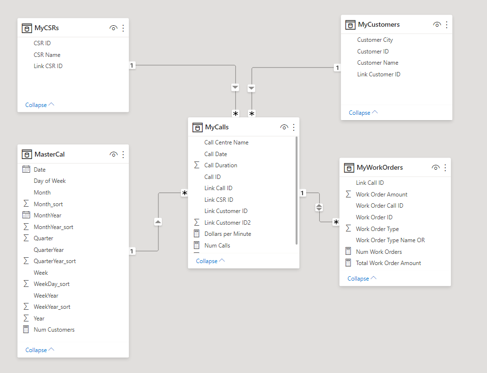
The original data model had two tables: MyCalls and MyWorkOrders. This new data model extends this by adding in:
- MyCustomers: The customers who placed the calls and whom the work orders were created for
- MasterCal: A master calendar for allowing for drill down within a period hierarchy (i.e. Year -> Quarter -> Month -> Week -> Date)
- MyCSRs: The Customer Service Representative (CSR) working for the telecom. The CSR answers customer calls and interacts with customers resulting in work orders for the customer
As an aside: You may have noticed There is also a table called “WorkOrderTypeAND” which I originally included to demonstrate a feature that is specific to QlikView; It allows the analyst to make ‘and’ based user selections (as opposed to ‘or’ based user selections) and is not found in Power BI (nor Qlik Sense). While this feature does allow us to ask more questions (e.g. Who has Television AND NOT Internet), it is not inherent to the point I am making here. For this reason, I have since decided not to leave discussion out of this blog post, but if you’re curious about how it works you can download and experiment with the demo to see its functionality.
Here is how the model appears in QlikView:
Here is how the same model (minus the ‘AND’ table) appears in Power BI:
Now let’s get into the business questions.
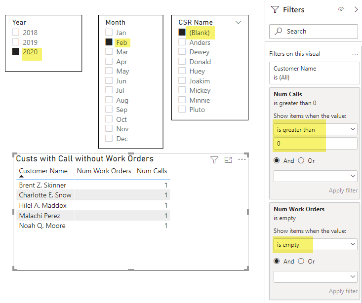
To recap, our main question is: During February 2020 which Customers placed calls to the Call Centre without an authorized/known Customer Service Representative and did not generate any Work Orders?
For context, in our example there was a botched Chatbot roll-out issue in February 2020 that resulted in customers (who learned of the flaw through social media) creating non-authorized Work Orders using a special promo code. We want to know who penetrated the vulnerability but did NOT take advantage of the flaw. When we find these Customers, we would like to thank them and speak with them to help uncover other security issues communicated through social media.
To get there we need to find Calls with no CSR and from there find Customers with no Work Orders in February 2020.
We are going to break this down into two exploratory (practice) questions to show how those can be answered and then combine what we have learned to answer the third and final question During February 2020 which Customers placed calls to the Call Centre without an authorized/known Customer Service Representative and did not generate any Work Orders?
By breaking down our big question into smaller exploratory questions we can begin to get a sense of what is going in the data before diving into our third an final question.
Our two exploratory questions are:
- What is the distribution of calls with no authorized CSR?
- What Customer did not have any Work Orders February (of any year)?
Question #1: What is the distribution of calls with no authorized CSR?
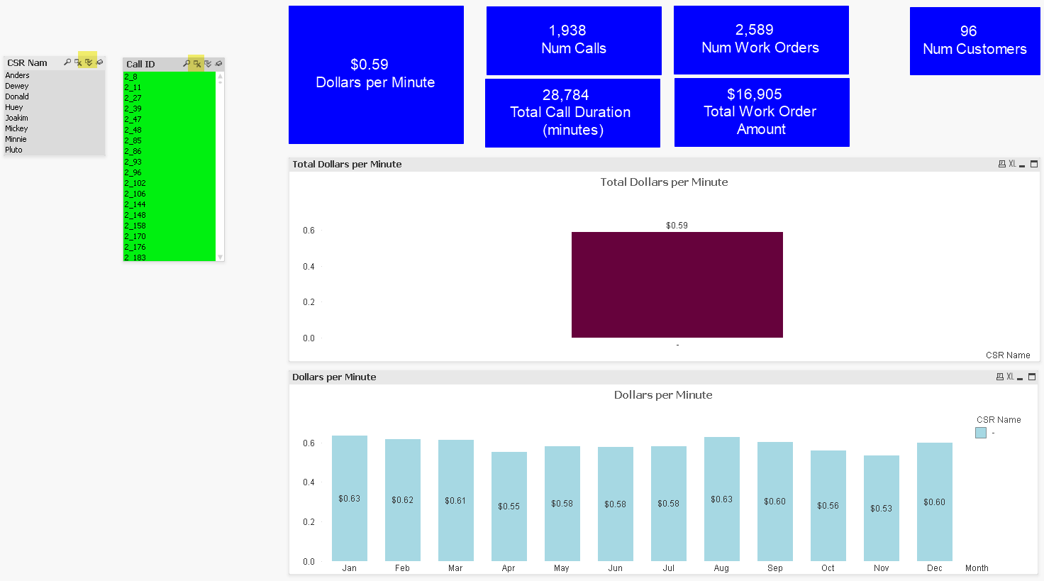
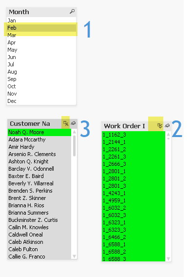
In Qlik, to answer this question we:
- Select [All] in “CSR Name”
- Select ‘Excluded’ in “Call ID”
In Power BI, we simply:
- Select ‘(Blank)’ in “CSR Name”
As can be seen in the above example, both Qlik and Power BI allow for interactive selection here with Power BI being better than Qlik in this instance given that you only need to click one button in PBI versus two clicks in Qlik.
Now let’s move to our next question.
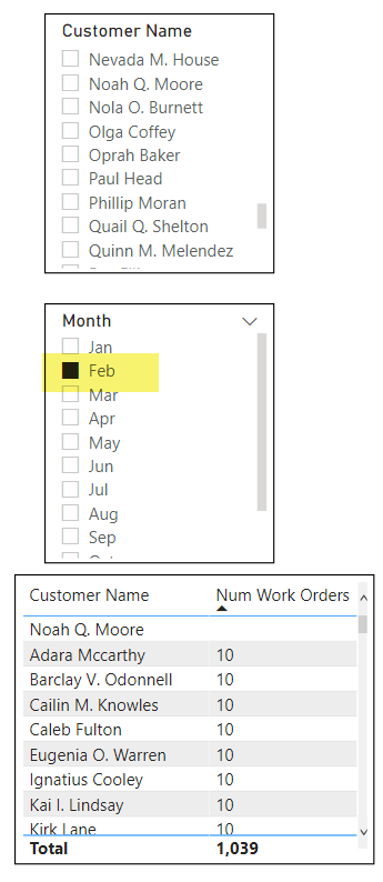
Question #2: Who are the customers with no Work Orders for February (of any year)?
In Qlik we can answer this question by making three selections in real time:
- Select ‘February’ in “Month”
- Select [All] in “Work Order ID”
- Selected [Excluded] “Customer Names”
The answer is revealed as ‘Noah Q. Moore’.
In Power BI however, because of the one-to-many relationship, we cannot rely on Slicers alone. Instead we must take extra time to construct a Table (remembering to set the “Show items with no data” setting), wait for the table to render, then sort the table from smallest to largest (or we could have filtered on blank “Num Workers”). The resulting set cannot be selected as a Slicer selection, so the user is tightly limited in the follow-up questions they may ask.
Having answered both of our exploratory questions we are now ready to begin answering our third and final question.
Question #3: During February 2020 which Customers placed calls to the Call Centre without an authorized/known Customer Service Representative and did not generate any Work Orders?
Or stated differently: Who are my most honest customers; The customers who when calling without a legitimate CSR in February 2020 never created a Work Order?
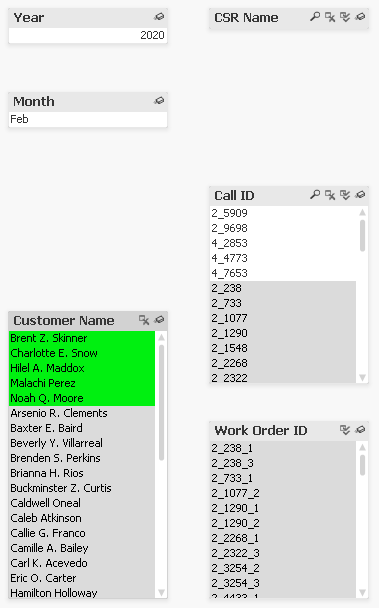
To answer this question in Qlik we can do so through 2 simple iterations:
Iteration 1:
- Find all calls without a CSR. Two clicks:
- Select [All] CSRs
- Select [Excluded] Calls
- Filter on year and month:
- Select on ‘Feb’ in “Month” and
- Select ‘2020’ in “Year”
- Isolate this filtered subset by selecting from main menu File->Reduce Data->Keep Possible Values
Iteration 2 (using subset derived for ‘Possible Values’ in Iteration 1):
- Find all Customers with no Work Order
- Select [All] in “Work Order ID”
- Select [Excluded] in “Customer Name”
FINISHED. We have answered our question. The five customers are:
- Brent Z. Skinner
- Charlotte E. Snow
- Hilel A. Maddox
- Malachi Perez
- Noah Q. Moore
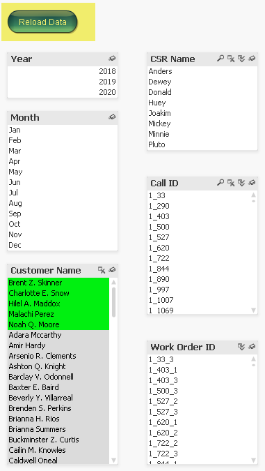
If we want to see these Customers in their original context (as opposed to in the isolated Dataset), we can refresh the data which reverses the data reduction while keeping the selections.
How does Power BI compare?
Power BI can certainly answer this question but requires more Chart/Table building. In this scenario, it is not enough to simply list all the Customers and sort by Num Work Orders, because we need to be sure we are only seeing Customers with Calls. Even if we “Select All” Calls our Table will continue to show Customers who did not receive any calls in Feb 2020 because we have not explicitly filtered our Customer list by the number of Calls.
This means we must add a Visual Filter on the Table itself where “Num Calls” ‘is greater than 0’.
Given that we are already filtering on “Num Calls” we can also filter on “Num Work Orders” ‘is empty’ to create a cleaner looking table.
Even with our clean table, it is still not easily possible to convert this list into a Slicer selection and then explore and ask follow-up questions about these five (5) Customers further. Whereas in QlikView we have the Customers selected and can easily continue our game of ’20 Questions’.
Normally in this situation the Power BI developer would likely go up to the Data Prep level and use either Power Query or perhaps Excel to answer this question.
Going back to our sharpening and chopping analogy taken from Abraham Lincoln this means that in Qlik you are chopping more than sharpening and in Power BI you are sharpening more than chopping.
The ideal tool in my view behaves more like a musical instrument that you play like a piano.
Data and App Documents
Here are the data files:
Here are the application documents:
Conclusions
Given that Analytics involves exploring both positive and negative space and Qlik’s Associative Index explicitly supports “Excluded Values”, and given that most other BI tools - like Power BI – do not inherently support Excluded Values, then why has Power BI and other tools like Tableau for that matter managed to outperform Qlik from a sales perspective?
More to the point, why is ability to query “Excluded Values” – a core element of Analytics - not even even brought up as a software requirement?
The simplest answer to this question is that the buyers of these tools lack connoisseurship.
I can break this answer down to three specific problems:
- IT tends to favour homogenous technology platforms and deal with as few vendors as possible. “One throat to choke” as they say.
- The “drill” pattern tends to be visual in nature and is what most senior managers – and laypersons - can quickly grasp. These are the same people who control spending.
- The “contrast” pattern on the other hand is more obscure in nature and does not lend itself to flashy sales demos
- The “contrast” pattern as I described it above is generally regarded as a Data Prep (as opposed to Business Intelligence/Data Viz) activity
- Qlik’s answer to the “contrast” defies traditional product categories
- There are no recognizable competitors to Qlik that also have the ability to query “Excluded Values”
The first problem of IT favouring homogeneous technology over “best of breed” vendors is not specific to Qlik and is fairly well understood and discussed problem. I have nothing to add that discussion here that has not already been said.
The second problem of how Business Intelligence/Data Viz tools are often sold based on slick demo is also nothing new. Although I will add some colour to this: On more than one occasion I have seen a senior executive extol the virtues of a Business Intelligence tool for the simple reason that they used a report built with this tool. Even if that report is nothing more than a rendered image file, the executive will continue to lavish praise on the tool which quickly creates buying consensus.
Oh, but you may say that there are research firms and consulting companies that executives can look to for guidance. Unfortunately, these companies tend to all be deeply compromised in one way or another. Without naming names, think of the most prestigious business & technology research company and advisory consulting company you can think of, and I can show you how they don’t hold a candle to
Consumers Reports. The main problem is these companies have deep relationships with the vendors they are supposed to referee. We can see elements of this in journalism whereby many esteemed newspapers and media outlets will be more generous to certain institutions or individuals in order to maintain “access” to those institutions and individuals. Consumers Reports on the other hand is entirely supported by a large consumer base. Even Consumers Reports is not perfect, but it is significantly more trustworthy than any of the research and consulting firms in the B2B world when it comes to evaluating technology.
The third problem can best be understood through this famous quote from Henry Ford: “If I had asked people what they wanted; they would have said faster horses.”
Putting our analytical hat on, if we contrast Ford and Qlik in this light we can see that Ford has the clear upper hand:
- Their cars will work on any roadway (unlike the closed railway lines)
- The purchaser of the product is also the user and a slick demo is not enough – the vehicle must pass a test drive
- While Ford was an early manufacturer of automobiles, he was not the first or only manufacturer and the presence of competitors created consumer demand
As a result, was Ford less of a “think different” underdog and more of a monopolistic bully. There is another lesson to be learned from Ford, a lesson that many Canadians are aware of:
During the early days of automobile production Ford clashed with an inventor based here in Canada: P.L. Robertson the inventor of the Robertson screwdriver, also known as the ‘square’ screwdriver. You can read the story
here.
To quickly summarize, in 1908 the Canadian P.L. Robertson invented a new type of screw head and screwdriver that was square shaped which allowed for maximal torque while minimizing stripping. This allowed the Robertson screws to be more securely fastened. Henry Ford realized the importance of this invention and demanded Robertson relinquish the patent rights to Ford for a single lump sum. Robertson refused and so Henry Ford went to a competitor, Henry Phillips, who had invented a similar but inferior screwdriver, the Phillips screwdriver. Phillips did maintain some patent rights though and thus the still inferior flat-head screwdriver continued and continues to proliferate.
If we all switched to Robertson screws, we would need fewer screwdrivers and screws, and construction quality would improve.
And yet, if you asked an American they would at first be oblivious and then confused as to why the United States would be committed to a demonstrably inferior product. The simple answer is the same reason why we use Microsoft: Vendor lock-in through network effects. But the fact that Robertson remains in use also tells us that it is possible to survive and even thrive based on the merit of the tool itself.
I come back to the word connoisseurship, and for reasons of environment and circumstance connoisseurship differs among people and organization.
How does change come about then and why should anyone care?
For me the answer is simply emotion through experience: The experience of
awe and
wonderment and feelings of mastery and contentment from achieving flow states.
If you have ever discovered a powerful tool and have wielded it to great affect, then you will know these feelings I am talking about and you will yearn for these feelings.
But if you have never had such a breakthrough and not experienced awe and a sense of mastery then everything I am saying will sound like noise. But I think if you have learned to ride a bicycle or swim or ski down a hill, then maybe you can relate?
I have thus decided that my
North Star going forward is to figure out ways I – Neil Hepburn - can bring about a feeling of awe and wonderment for Analytics. I may or may not use Qlik to help me here and have not decided. But I have no doubt that Qlik has helped me understand the essence and spirit of Analytics and I am going to challenge myself to see if I can bring about that experience of awe to others.
If this is something you are interested in hearing more about, you are welcome to drop me a line.