Update 2021-01-12
An astute reader (thank you reader!) has pointed out a flaw in part of the experiment. I have since updated and re-run this part of the experiment to address the flaw.
In summary, the flaw was that I had five (5) Measures in both Power BI and Qlik. But in Power BI these Measures were all being executed as separate queries whereas in Qlik they were being executed as a single query.
I have since added a new section to the bottom of this blog that describes the change to the experiment and updates the conclusions accordingly.
Pre-Amble
This is the first of a three part blog post that will explore the concept of “Analytic Efficiency”. But before I introduce part 1 I need to take some time to explain what I mean by “Analytic Efficiency”.
“Data” and “information” as we have come to realize have always existed - it’s only recently (in large part due to the work of Claude Shannon in the mid-20th century resulting in Shannon’s “Information Theory” that showed how everything in the universe could be encoded as a ‘1’ or ‘0’ and therefore the foundation for everything is simply “information”) that we now think of “data” and “information” as abstract concepts unto themselves, and have come to realize that “information” is the fuel and power for decision making through an ancient and consistent process that we still to this day call “analytics”.
The way in which we perform analytics has not significantly changed since Aristotle first described the ‘syllogism’ in his work “Prior Analytics” which was put down in the middle of 4th century BCE - over 2,300 years ago. Efficiency has improved greatly since then, but fundamentally nothing has changed about the process itself. So powerful was Aristotle’s approach to logic (ordered thinking) that his books on logic were and are referred to as “Organon” which translates to “The Tool” - as in “The Tool of Philosophy”; Aristotle’s “Tool” was seen as something that was above philosophy itself. During the Middle Ages philosophers of all faiths like Averroes, Maimonides, and Thomas Aquinas referred to Aristotle simply as “The Philosopher”; as though there were no other philosophers were worthy of the title. Even to this day Aristotle’s shadow looms large over philosophers and mathematicians working in the “Analytic tradition”: Great thinkers like Descartes, Spinoza, Leibniz, Kant, Frege, and Russell.
Furthermore, Euclid’s “Axiomatic Method” is built on the foundation of Aristotle’s syllogism, and those that are familiar with the history of mathematics and science will know that Axiomatic Method is what the modern world of science, technology, and engineering is built upon.
Analytics is essentially a recursive game of “Twenty Questions” (more like “infinite questions”) that continually feeds back on itself: You start with an objective question (e.g.“Where are my most profitable customers?” or “Are we living in a computer simulation?”) and you break that big question down into little questions (the Greek origins of the word “analytics” means ‘to dissolve’ or ‘break down’) until there are no more questions to ask and at that point the answer either reveals itself or you might find out (such as the case with quantum physics) that the answer cannot be known.
The game of Analytics is simple but it is not always easy. The game can also be described as the “Analytic Lifecycle”. The Analytics Lifecycle itself can be broken down (dissolved) into these five steps (as I see it from experience):
- Identify data needed to answer the question (this might be easy if the data is in a standard report available to you, or this might be tricky if you are not authorized to see the data in its raw form and must work with a trusted data steward [who might have other priorities] to negotiate a data request).
- Obtain the data (this may be as simple as downloading a file or it may involve spending billions of dollars to build something like the Large Hadron Collider or a Gravitational-wave Observatory).
- Prepare the data (this might be something simple like copy-and-pasting data and performing a VLOOKUP across two tables in Excel, or this could involve training a Deep Neural Network to generate predictions as the desired dataset for further analyses into say, ethnic biases of a recommendation tool).
- Analyze the data (this is the interactive and core part of the game of 20 questions where the analyst works in real time “slicing-and-dicing” and “drilling” the datasets that were just prepared, to thoroughly answer the original question by also asking follow-up questions. Put another way, this is where most of the questions are being asked and answered). This step often depends on how well the data was prepared, what tools are being used for interactive analyses, and most importantly what contextual knowledge the analyst has so they are asking the most relevant and impactful questions.
- Present the answer/insight back to the original audience (this can entail anything from building a Data Visualization [e.g. heat map overlaid on geographic map] to an Infographic to building a Data Story presentation, or if you have the ability or resources, a Conceptual Animation video can be impactful at scale.
When you reach step 5 and present the result back to the audience, they may be satisfied with the answer, or they may ask a new “Objective Question” based on the answer from the previous question. Aristotle believed that conclusions from syllogisms that are unexpected are the most interesting of all. Case-in-point: When the LHC detected the existence of the Higgs Boson particle, many saw this as confirmation of what was already known rather than any new insight, and so interest has died down. However, when telescopes were able to show that the actual size of the universe is not what Einstein’s equations had predicted, this has led to research surrounding Dark Matter and Dark Energy that continues to propel scientific inquiry to this very day.
Thus the process can and will keep going for as long as there is curiosity and interest and resources.
——
As with any lifecycle process bottlenecks may arise at any step of the process. For Parts 1 and 2 of the blog post I want to focus specifically on step #4 of the Analytic Lifecycle, “Analyze the data” with respect to two tools: Power BI and Qlik.
In part one (this post) I will summarize the differences between Power BI and Qlik’s indexing engine and go over the results of two performance tests I performed to illustrate the strengths and weaknesses of each engine.
In part two I will describe - using a simplified example - how exactly the Tabular Model processes queries versus Qlik’s approach.
In part three I will explain what this reveals about the nature of Analytic Efficiency and why MS Excel (and other spreadsheets) dominate Analytics even when we are repeatedly told that this is not how we ought to be doing analytics, and what those scolding messages about Excel are missing about the deeper nature of Analytic Efficiency.
If you are curious about technology or business but not interested in a deep dive into the underlying mechanics, then I suggest you skip to the third post.
If you are someone whose mantra is “show me the results”, then this post provides that hard benchmarking data.
And, if you are curious about the “HOW” of Qlik and Power BI, then you should read all three posts.
That’s the end of my preamble, now on with my first post…
Introduction
For many years I have speculated on the internal architecture of Qlik’s indexing engine. If you are a regular user of QlikView or Qlik Sense you may have a feeling for what I am talking about here. It’s a combination of performance and User Experience that is rather unique and if you know how to use the tool this can work wonders for analysis.
But until recently I have struggled to articulate this difference and benefit that Qlik has over other BI tools.
My thinking until recently was that Qlik’s great innovation was what I refer to as a “linking model” (as opposed to “cube model”) and that this was the sole distinction between Qlik and other BI tools.
As such, I was excited when Microsoft released PowerPivot in 2010 since I could see that Microsoft’s new approach to BI would be very similar to Qlik’s: They both shared a linking model that would allow developers to break through the “fan trap” problem that plagued so many cube-based models and led to the clunky “conformed dimensions” solutions I would occasionally see.
To explain this problem quickly: Traditional cube-based architectures - like those pioneered by Essbase and Cognos and written about extensively by Ralph Kimball in his seminal “Data Warehouse Toolkit” books - have a problem when multiple fact tables (e.g. “Calls” and “Work Orders”) are required. The reason is that when you merge multiple fact tables into a single table (e.g. “Calls” and “Work Orders”), the table with the lower cardinality (in our example this is “Calls”), what will happen is duplicates will appear, since there must be one record for each “Work Order” record even though multiple Work Orders may belong to a single Call. There are a few common solutions to this problem but the prescribed industry solution is to effectively synchronize filtering on two cubes such that they appear to be acting as a the same cube. But there is a problem with this solution: Conformed Dimensions don’t work with high cardinality “Degenerate Dimensions” like a “Call ID”, and so we must employ highly skilled data modelers to choose other dimensions to link on such as the Call Date for example. But this can lead to another trade-off known as a “chasm trap”, where it is not possible for the analyst to answer simple questions like: “Show me all the Work Orders for Calls that lasted less than 20 seconds?”
Both Qlik and Power Pivot (which would later evolve into Power BI) do not have this cube limitation because they CAN link on the degenerate dimension – on the Call ID – and because there is little skill required to figure out this, because the source data model makes this obvious – anyone with just a half-day training can now build linked models that are far superior to the cube based models of yester-year. This is a huge step forward for Analytics and Business Intelligence.
And for a while I was convinced that Microsoft had succeeded at copying Qlik’s technology (from the outside) and had made this linking concept mainstream. It seemed to me that Microsoft would soon come to dominate the BI industry, and my suspicions have very much materialized into reality.
All of that said, I also felt that there was still something different about Qlik’s indexing engine that I couldn’t quite put my finger on.
As time went on and Power BI’s march to popularity continued, I began shifting from to both using and teaching Qlik to using and teaching Power BI. I have been doing this for the past 4 or 5 years now, with almost exclusive use of Power BI over the past 2 years. But recently I have dusted off an older version of QlikView 11, and have begun using this tool as a kind of companion to Excel for performing analyses.
While it would be nice to work in an organization that is all-in on Qlik (as opposed to one that is all-in on Power BI which is becoming more and more common), I have come to appreciate and embrace a side of Qlik that goes beyond the linking model which I never fully understood or appreciated until this year.
So what is this “secret sauce” that has me going back to Qlik even when Power BI is on a tear adding new features at least once a month, and is integrated into everything Microsoft can think of including their new “Synapse” platform (which I will admit is a very compelling system)?
Qlik’s Secret Sauce
The difference between Power BI’s Tabular Model (a.k.a. Vertipaq engine) and Qlik’s Associative Model is that Power BI is table-centric whereas Qlik is value-centric.
The most salient difference from a user perspective is how Slicers/Filters perform and behave: In Power BI, Slicers can slow down Page load times and only show all values (irrespective of other selections) or all possible values (based on other user selections). In QlikView and Qlik Sense, the equivalent Filter boxes have negligible impact on Page load time and always show both the Possible and Excluded values (based on other selections), allowing the user to always see all values of any given field while knowing what is in scope and what is out of scope based on other field selections.
The reason for these differences is that when you make a Slicer selection in Power BI, Power BI must scan through the rows and columns of the underlying tables to then find the values to aggregate, or determine what values are possible in other columns. This design is relatively intuitive and is how most people would design a linked model BI platform using a Columnar Datastore.
Qlik on the other hand take a completely different approach: Qlik uses selected values to determine which other values are possible through value-to-value mapping indexes known as a “BAI (Bi-directional Associative Index)”. If that sounds confusing, don’t worry as I will explain in the next blog post exactly how this works (if you care to read). The benefit to this approach is quite straightforward: For any given column Qlik can – without having to perform additional calculations – tell you all the distinct values that are possible and those that are excluded.
This is why QlikView’s List Box and Qlik Sense’s Slicer object can show you both possible and excluded values, and renders these lists so quickly. It is also why in Qlik you can perform full text searches against all fields with relatively little effort.
Power BI in contrast has a rather sluggish User Experience when it comes to its Slicers performance, and does not show excluded values. Furthermore, only recently has a full text search option been added (which has been a big help), but this is only for a specific Slicer, and will only reveal possible values (as opposed to excluded values) and as such falls short of a useful full text search engine because it only shows you results based on what is included in the Slicer’s list of possible values.
At this point if you’re still reading you might be asking the question “Does this really matter?” and “How does different technology impact typical usage patterns, like filtering on KPIs and Charts?” After all, BI tools are mostly sold on the promise of data visualization and interactive drill-down charts.
To answer this question, I devised an experiment and tested it with two dataset variants that had characteristics that I thought would exercise both tools and illuminate the question of overall performance.
Experiment Overview
The experiment pertains to a fictional Telecom company with a Call Centre (let’s call it “MyTelco”), that earns revenue through service subscriptions (e.g. television, Internet, etc.).
MyTelco has a call centre which logs call centre activity to two tables:
- MyCalls
- MyWorkOrders
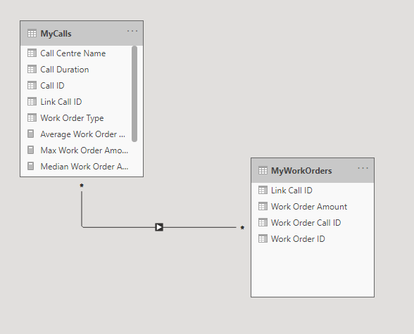
MyCalls lists all the Calls into the call centre and MyWorkOrders lists all the Work Orders generated by the call centre (through a customer call).
The MyCalls table can be filtered on by the “Call Centre” column/dimension and there are five (5) call centres (North, South, East, West, and Central). The calls are randomly distributed by Call Centre throughout the Call table.
The Work Order table contains Work Orders that were generated (and linked) by a Call.
The Work Order table therefore links to the Call table using the “Call ID” from MyCalls.
Linking (as opposed to merging) the Call and Work Order table is necessary to avoid “fan trap” whereby a single Call has multiple Work Orders, thereby potentially duplicating the Call record and skewing the Call Duration. For example, if we had a Call which lasted 4 minutes and generated 2 Work Orders and we merge the MyCalls record with the MyWorkOrders record, our call duration would be duplicated and would go from 4 minutes to 8 minutes. Hence this is why we must link instead of merge the two tables, and this is also why both Power BI and Qlik are well suited to this challenge.
Each Call may have 0,1,2, or 3 Work Orders. Therefore some Calls will not link to any Work Order.
The KPIs (i.e. Measures) are all based on the Work Order Amount (measured in dollars) and all calculate in linear time. These Measures are:
- COUNT([Work Order Amount])
- SUM([Work Order Amount])
- AVG([Work Order Amount])
- MAX([Work Order Amount])
- MIN([Work Order Amount])
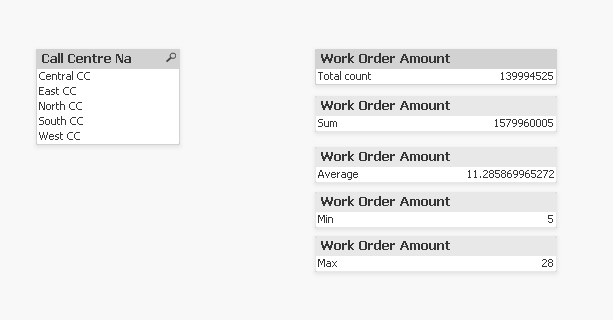
This shows the KPIs as implemented in both Power BI and Qlik, respectively:
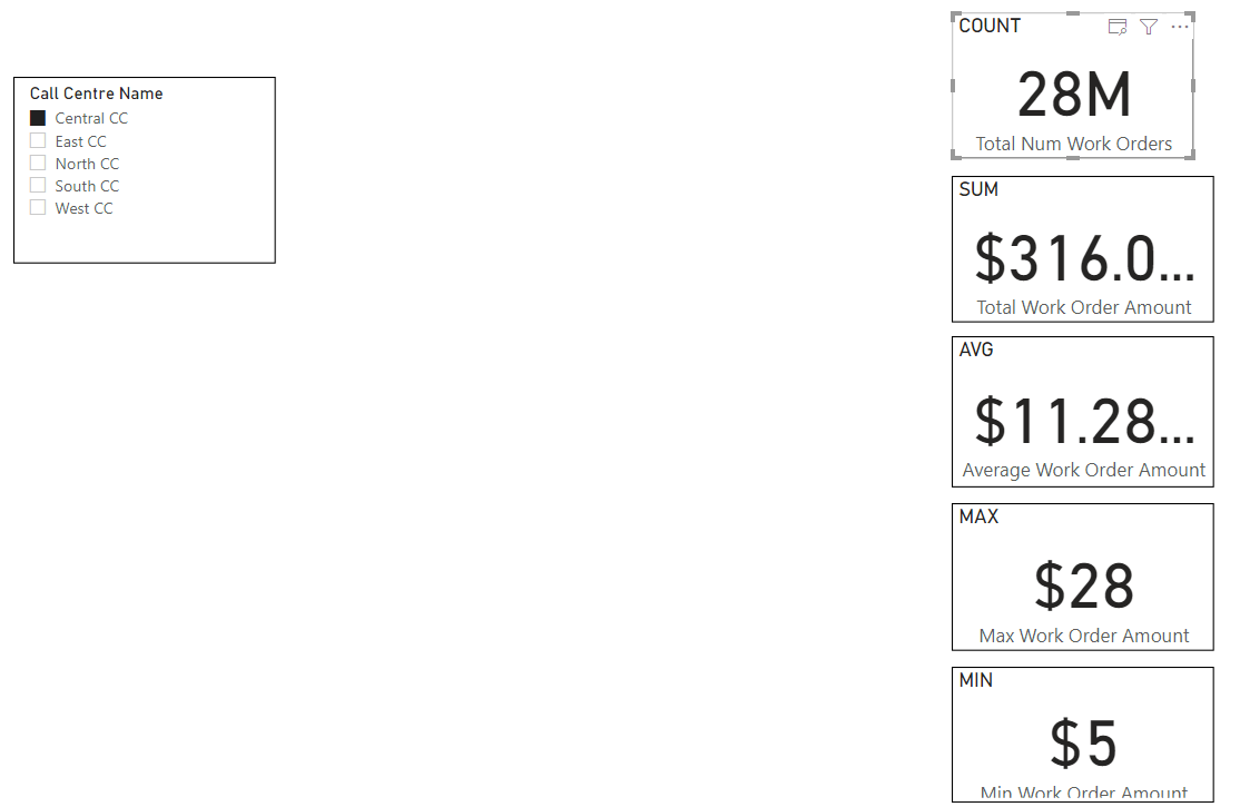 |
| Power BI |
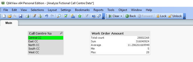 |
| Qlik |
It is worth noting that all of these measures have a linear time complexity, as opposed to something like a COUNT DISTINCT or MEDIAN which has a greater than linear time complexity, specifically O(n log n).
I did originally include MEDIAN but found that Power BI threw out-of-memory errors for this. After some reflection I realized that it was not necessary to include this for this experiment since the purpose of the experiment is to test the Relationship/Link indexing performance as opposed to the aggregation performance. To that end, linear measures more clearly reveal these differences.
I only included the MEDIAN to begin with because it is good and common practice to test performance using non-linear Measures. But I’m glad I gave this MEDIAN a second thought and removed it because it would have only added noise.
Experiment Details and Results
To recap, I created two datasets each with two tables. The datasets are based on hypothetical Call Centre data composed from two tables:
Dataset 1 (high cardinality linking):
- “MyCalls” (100 million rows); and
- “MyWorkOrders” (140 million rows).
100 million distinct Call IDs link these tables together. The table has a one-to-many relationship going from “MyCalls -> “MyWorkOrders”
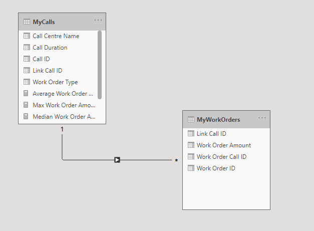
This is how the linked model appears in Power BI (for high cardinality example):
 |
| Power BI |
Here is how the linked model appears in Qlik (for both high and low cardinality):
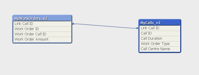 |
| Qlik |
Dataset 2 (low cardinality linking):
- “MyCalls” (100 million rows); and
- “MyWorkOrders” (140 million rows).
Dataset 2 is nearly identical to Dataset 1, but has only 100 distinct Call IDs that link these tables together. Also, when I changed the Call ID values, this led to a many-to-many relationship between “MyCalls” and “MyWorkOrders”. Although this change to many-to-many does not appear to have any negative impact on performance.
Here is how the low cardinality Dataset v2 model appears in Power BI:
 |
| Power BI |
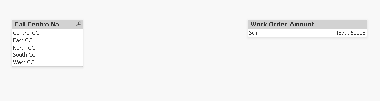
Most of the columns including “Work Order Type” and “Call Duration” are not used for anything and can be ignored. The relevant columns are:
- “Call Centre Name”: the field we are filtering on in the parent table
- “Link Call ID”: the field linking both tables
- “Work Order Amount”: the field we are aggregating in the child table
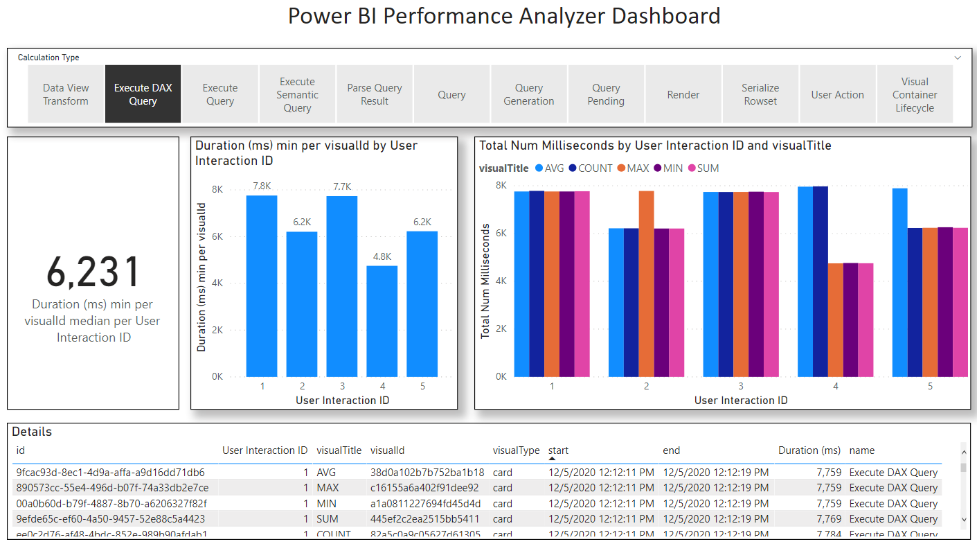
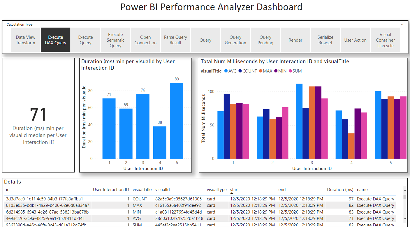
What I was expecting before putting this test together was that Power BI would have outperformed Qlik in both tests. I wasn’t even planning on performing the second low-cardinality test because I inferred based on my understanding of how the indexes worked that Power BI would have outperformed Qlik. But to my surprise I got the opposite result: Qlik’s index performed nearly four times (4x) faster than Power BI for linear aggregations across linked tables. Furthermore, Qlik’s disk and memory footprint were also approximately 3x smaller and as mentioned earlier there were non-linear aggregations I could continue to do in Qlik – like calculate the Median Work Order Amount – which in Power BI triggered an out-of-memory error.
In response to this finding, I produced another test data of the same overall volume but using a miniscule fraction of Call IDs to link the two tables together. Specifically, I went from 100 million link keys (based on Call ID) down to 100 link keys – one millionth the original number of keys. Through this change I was able to get better performance out of Power BI than from Qlik. But I should point out that the performance differences, while objectively different, were harder to perceive since both tools produced sub-second response times. Contrast this second test to the first test (that used high cardinality linking keys) where would typically wait around 1.9 seconds for Qlik while waiting for 6 or 7 seconds seconds for Power BI. 1.9 seconds versus 6 or 7 seconds is noticeable, and with each passing second you can feel your mind beginning to wander.
To conclude: For high cardinality linking keys Qlik performed 4x (rounded) better than Power BI, and for low cardinality linking keys Power BI performed 15x (rounded) better and both performed in sub-second time.
Experiment Biases, Supporting Calculations, and Artefacts
At this point I should provide some more information about my background and biases: I have worked with Qlik since 2009 and Power BI (in the form of Power Pivot) since its release in 2010, but not in earnest until around 2016. From 2009 through to 2017 I was a heavy user of Qlik, but around 2017 client demands began to shift to Power BI and I followed suit and have been working almost exclusively with Power BI since 2018 (although I have begun to move back to using Qlik more these days). If I am to be honest with myself my bias is more towards Qlik mainly because I believe I have a faster Analytics Velocity with Qlik. Although I see both tools (which both support linking models) more similar to each other than compared to the majority of other cube oriented BI tools and am happy to use either Qlik or Power BI for this reason.
With all of that said, I want to ensure that the testing and measurement was as fair to Power BI as possible and if there were errors in measurement, they would benefit Power BI. To that end I should explain how I measured performance in both Qlik and Power BI.
In Power BI Desktop (I used November 2020) there is a built-in tool you can use called Performance Analyzer. This tool provides precise measurements of query time, render time, and other times (e.g. waiting). I used this tool for all Power BI measurements. I also excluded non-query measurements from my final measurements keeping only the “Execute DAX Query.” Finally, I prepared 5 aggregation KPIs and took the fastest of the 5 for each measurement (overall Page Load time should in fact be based on the maximum load time). This last choice I made favours Power BI the most.
In QlikView (I used version 11) there is no built-in Performance Analyzer tool so instead I took manual measurements using my phone as a stopwatch. In my approach I would simultaneously click into the QlikView List Box while tapping my phone to start the stopwatch while keeping my eye on the Statistics Box (which contains the KPIs). Then when I could see Qlik had finished loading new results I would hit stop on my stopwatch. There is a slight lag – up to 200 ms – that occurs when taking measurements in this way, so all my Qlik measurements are probably a bit longer than they should be. And because I only looked for the overall KPI/Statistics box to refresh I was not able to separate out the individual KPI load times nor was I able to separate out render time from query time. This approach slightly handicaps Qlik.
To recap, this is how I favoured Power BI over Qlik while taking measurements:
Power BI | QlikView |
Precise measurements using Performance Analyzer | Imprecise measurements using separate physical stopwatch. Lag time from seeing KPI render to hitting stop. |
Only measured DAX Query time | Measured query time and render time |
Out of 5 KPIs used fasted to calculate | Out of 5 KPIs used slowest to calculate |
All that notwithstanding and in the interest of science and transparency I will make these further disclosures: I loaded the data using Power BI September 2020 and performed tests using September 2020, October 2020, and November 2020 versions of Power BI and noticed November 2020 was a bit slower than September 2020, October 2020 and, but not significantly. Thus Power BI may have added additional features that take up CPU.
The latest versions of Power BI are much more feature rich than QlikView 11 IR and those additional features may also contribute to performance bottlenecks. Finally, Power BI is using a modern HTML5 render engine whereas QlikView is based on a native Windows API which generally renders quickly.
But with all of that out there and said, the data still points to a clear performance benefit of Qlik’s engine over Power BIs. And while I cannot promise the same result in Qlik latest Qlik Sense version, I expect it would be similar.
Let’s get to the result details.
The table below summarizes the measurements and how what our conclusions are.
Tool | Selection | V1 (High Cardinality) Duration (ms) | V2 (Low Cardinality) Duration (ms) |
Qlik | Central CC | 1480 | 1200 |
Qlik | East CC | 1530 | 1010 |
Qlik | North CC | 1450 | 1100 |
Qlik | South CC | 1660 | 990 |
Qlik | West CC | 1550 | 1170 |
Total |
| 1530 | 1100 |
Power BI | Central CC | 7759 | 71 |
Power BI | East CC | 6209 | 59 |
Power BI | North CC | 7734 | 76 |
Power BI | South CC | 4752 | 38 |
Power BI | West CC | 6231 | 89 |
Total |
| 6231 | 71 |
Qlik Improvement factor |
| 4 |
|
Power BI Improvement factor |
|
| 15 |
What follows below are more details including screenshots, Performance Analyzer data and a Performance Analyzer Report I built to analyze the data.
For Power BI I have attached the Performance Analyzer Output.
PowerBIPerformanceData_v1.json
PowerBIPerformanceData_v2.json
I have also attached corresponding Power BI Reports so you can explore this Performance Analyzer output.
 |
| V1 Performance Analysis for Power BI |
 |
| V2 Performance Analysis for Power BI |
There are the software versions used for the experiment:
- Power BI I used version 2.87.1061.0 64-bit (November 2020).
- Qlik I used QlikView version 11 IR (released in 2012)
Here are screenshots showing my laptop specs:


Finally, I have included the actual Reports themselves and the underlying data. I should note that I am not including the High Cardinality version of the reports (which are identical in structure to the low cardinality reports), but I am including the low cardinality reports and a “tiny” sample of both high and low cardinality data files so you can see what it looks like.
In lieu of not including the huge reports I have included this screenshot so you can see how big the documents are and the difference in size for the same underlying data.


Here are the reports for Power BI and Qlik, respectively:
Analyze Fictional Call Centre Data v2.pbix
Analyze Fictional Call Centre Data_v2.qvw
Here are the data files:
Experiment Update 2021-01-12
 |
| Power BI |
 |
| Qlik |
The table below summarizes the measurements and how what our totals have changed significantly.
Tool | Selection | V1 SUM only (High Cardinality) Duration (ms) |
Qlik | Central CC | 1600 |
Qlik | East CC | 1160 |
Qlik | North CC | 1310 |
Qlik | South CC | 1610 |
Qlik | West CC | 1520 |
Total |
| 1520 |
Power BI | Central CC | 1694 |
Power BI | East CC | 1546 |
Power BI | North CC | 1553 |
Power BI | South CC | 1625 |
Power BI | West CC | 1667 |
Total |
| 1625 |
Qlik Improvement factor |
| 1 |
Power BI Improvement factor |
| 1 |
Here is the Power BI performance data visualized in my Performance Analyzer dashboard:
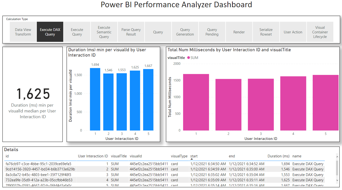 |
| V1 SUM only Power BI Performance Output |
For transparency I have attached both the Performance Analyzer JSON data and the PBIX I used to analyze the data.
PowerBIPerformanceData_v1_SUM.json
V1 SUM Performance Analysis.pbix
As you can see from the table above, the difference between Power BI and Qlik are imperceptible (to a human) with Qlik showing very slightly better performance. But the delta is within margins of error that I would call it a tie. I'm sure it would be possible to re-run the experiment and get a better result for Power BI under the right conditions. Again,I see the updated result as effectively a tie.
This materially changes the conclusion from: "Qlik's engine can demonstrate performance 3x better than Power BI for large high cardinality linking relationships" to "Power BI and Qlik's engine show equivalent performance for high cardinality linking relationships."
That notwithstanding, my original expectation was that Power BI would outperform Qlik in this test. The reason I expected this is that Qlik's engine is optimized for its Slicer/Filter experience which I discussed above in the section "Qlik's Secret Sauce". in the original context this is tie is still somewhat of an unexpected finding. But to be clear let me re-state the conclusion:
2021-01-12, to conclude (superseding previous conclusion above): For high cardinality linking keys Qlik performed approximately the same as Power BI, and for low cardinality linking keys Power BI performed 15x (rounded) better and both performed in sub-second time.
Harkening back to the preamble of this post, Analytics is a feedback loop mostly driven by curiosity and interest. In that spirit I was curious as to how Qlik would perform if I separated out the single visualization object into five (5) separate objects, similar to the five separate Power BI KPI Cards.
You can see below how the modified QlikView dashboard looks after this change.
 |
| QlikView with separate Visualizations for each KPI/Measure |
After separating out the Visual objects into five separate objects I re-performed the test selections and measured the latency.
The table below summarizes the measurements in this new test with five separate visualizations, one for each Measure/KPI.
Tool | Selection | V1 SUM only (High Cardinality) Duration (ms) |
Qlik | Central CC | 1890 |
Qlik | East CC | 1710 |
Qlik | North CC | 1640 |
Qlik | South CC | 1480 |
Qlik | West CC | 1790 |
Total |
| 1710 |
As you can see from these results they are very similar to what we found when we Measured for the original combined visualize as well as for the revised "SUM only" version of the experiment. In other words, it would appear as though Qlik is doing a significantly better job at coordinating the separate queries than Power BI and we are not paying much of a price for the additional Measures. This is not to say that it's not possible to combine the five Measures in Power BI and get a similar result. But it is a common design pattern to use multiple KPI Cards on a given Page, so I feel the Qlik scenario is more typical.
It was not my intent to test this aspect of the query engine, but thought it worthwhile to share this insight all the same as it reveals something about both tools.
Next Blog Post
In my next blog post I am going to explain – using an example – how each of the underlying indexing engines physically work and why they are so different.
Stay tuned.


No comments:
Post a Comment