Recap
In the last article we looked at the differences between Power BI and Qlik’s indexing engines with respect to their Link-based (as opposed to Merged Cube-based) indexing technologies.
The reason why we performed this experiment is that after reviewing a Qlik patent (granted in April 2020) it became clear to me that Power BI and Qlik’s technologies, while appearing similar from the outside - because they both support complex link-based architectures – would be similar internally.
In fact, the two indexing technologies are quite distinct and this difference is most noticeable in the behaviour and performance of user filtering: Power BI Slicers versus QlikView List Boxes (or Qlik Sense Filters).
As such, I ran an experiment to see if this difference also created trade-offs with respect to traditional Business Intelligence operations such as calculating aggregate revenue across two linked tables.
What I discovered was that the performance – when an apples-to-apples comparison could be made – that the performance was about the same (although at first it looked like Qlik’s performance was 4x better, but this was due to a flaw in my experiment pointed out by a reader).
That said, I was expecting Power BI to outperform Qlik in this experiment (and did find a scenario where this was certainly the case) but was still surprised to see the performance was about the same when I ran the experiment with the main use case: High cardinality key linking.
This is a significant finding I believe because Qlik’s “Power of Gray” (a term used in Qlik’s sales & marketing materials) offers a massive benefit to business analysts (think Excel jockeys) who know how to leverage this “Power of Gray”.
This one minute video demonstrates Qlik's "Power of Gray".
My next blog post will get into this “Power of Gray” and why it is so powerful and how it can be leveraged to cross analytic efficiency thresholds leading to improved business outcomes.
Introduction
In this article we are going to explore both Power BI and Qlik’s filter controls – Slicers and List Boxes – as well as the underlying indexing technology which explains why the behaviour of this filtering is so different between the tools and why the “Power of Gray” comes easily to Qlik and why we do not see it in Power BI.
The purpose of this article is not to provide a complete description of the indexing and calculation technologies. Rather this article is intended to complement other materials (such as those we are linking to in this article) to show using an example how these engines differ.
But before we get into that I want to go over some additional performance measures I have taken that will help illustrate the qualitative differences between the engines. Namely, the differences that analysts would notice when using both tools.
Power BI Slicer versus QlikView List Box/Qlik Sense Filter
In Power BI, the “Slicer” object - which allows users to filter fields and drill into hierarchies - is comparable to QlikView’s “List Box” object, which is effectively the same as Qlik Sense’s “Filter” object. There are some functional differences between QlikView’s List Box and Qlik Sense’s Filter (e.g. QlikView’s List Box supports an ‘AND/NOT’ selection mode), but for the features we are discussing in this post, they are identical.
Hereon we will only refer to Power BI’s “Slicer” and QlikView’s “List Box”.
With that out of the way I need to explain how Power BI and Qlik differ with respect to Slicer versus List Box and why it is not possible to make an apples-to-apples comparison with respect to performance.
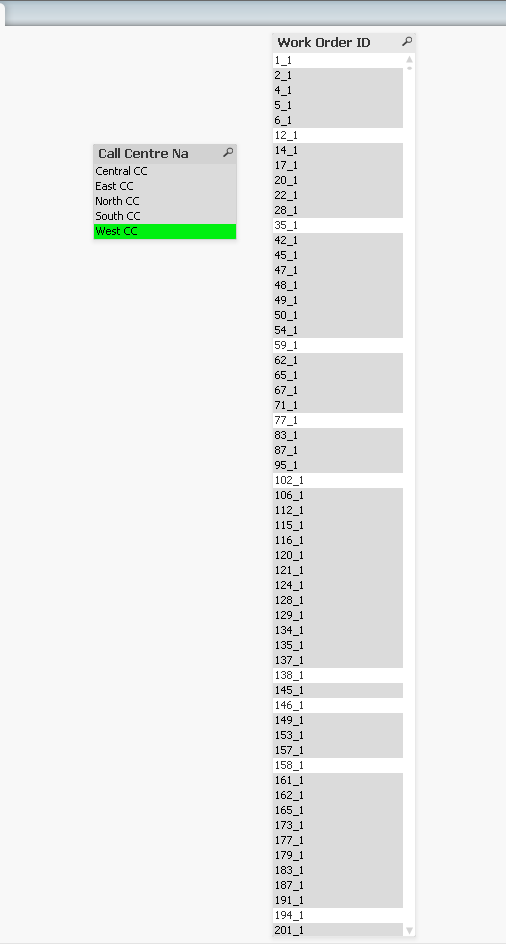
Power BI and QlikView both allow users to filter on field values (e.g. selecting the value ‘West CC’ in “Call Centre Name” field using PBI Slicer or Qlik List Box). But here are the two main reasons why we cannot compare their performance:
- Power BI Slicer shows possible values (based on other applied filters) versus Qlik which shows all values including values that are excluded by other field selections
- In our example, this means that if we select Call Centre l‘West CC’ in Power BI we are only showing Work Order IDs that are linked to the ‘West CC’ call centre. Qlik on the other hand displays all Work Order IDs, including excluded work orders (which are shown in gray as opposed to possible Work Order IDs which are shown in white)
- This means the QlikView List Box is showing 5x as many Work Order IDs than Power BI Slicer
- Power BI Slicer must always be sorted whereas it is possible to turn off sorting in QlikView’s List Box
- Sorting has a greater time complexity than retrieval and listing and is particularly noticeable when the number of values to be sorted is greater than 8 million.
- Without sorting, the time complexity would be linear – O(n). But because sorting has a linearithmic time complexity of O(n log n) and therefore is non-linear, the effort to perform sorting overwhelms any indexing efficiencies. This becomes noticeable even with more than approximately 1 million unique values in the field you are displaying in the filer (since the ‘log n’ multiplier starts to become a significant multiplier)
Putting #1 and #2 together, a performance comparison between Power BI Slicer and Qlik List Box cannot be apples-to-apples because Qlik and Power BI are dealing with different populations of distinct values while at the same time it is not possible in Power BI to separate the sort operation (with greater time complexity) from the retrieval and display of values.
In other words, Qlik must retrieve and display more unique values than Power BI while sorting that larger population.
With all that said I still went ahead and took some measurements to illustrate some of these differences and to get a sense of how the tools behaved.
Before I get into the measurements, it is important to be reminded that most of these measurements are really just measuring a sort operation, and that because we are selecting from 140 million rows, even a single Call Centre has 35 million rows (far more than the 8 million row threshold I mentioned earlier, where we start to see a steep decline in performance).
As an aside, it is for a similar reason why DBAs and Data Developers often choose to limit partitions to 8 million rows and why Microsoft Analysis Services Tabular partitions its own data [by default] into 8 million row “segments” and Microsoft 365 Power BI uses 1 million row “segments”.
Slicer versus List Box Observations and Measurements
The first thing worth noting is that Power BI itself ran out of memory attempting to display the Slicer when no values were selected.
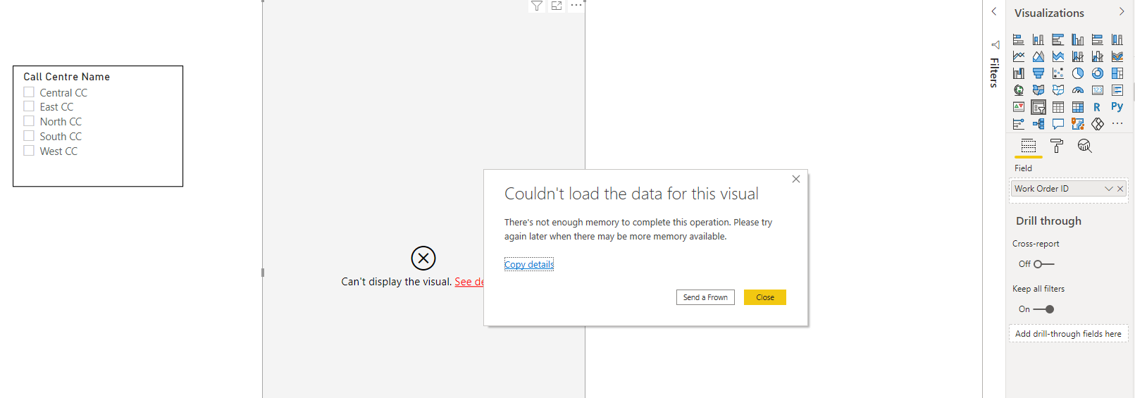
To be fair, if this were Azure Analysis Services, this may have been successful due to the larger 8M row Segment Size (as opposed to Power BI’s 1M Segment Size). So AAS would give us more options here while still staying on the Power BI platform.
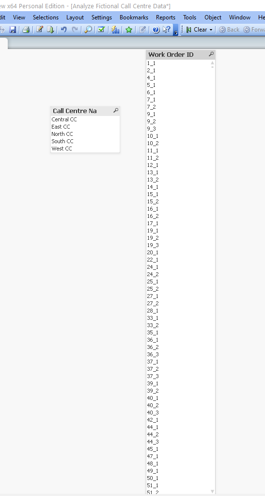
With QlikView it did take approximately a minute, but we did successfully see all the values (as shown below) on the same laptop as Power BI.
Fortunately, when I began making selections in Power BI the Slicer was processed successfully as you can see below when I selected the “West CC” call centre.
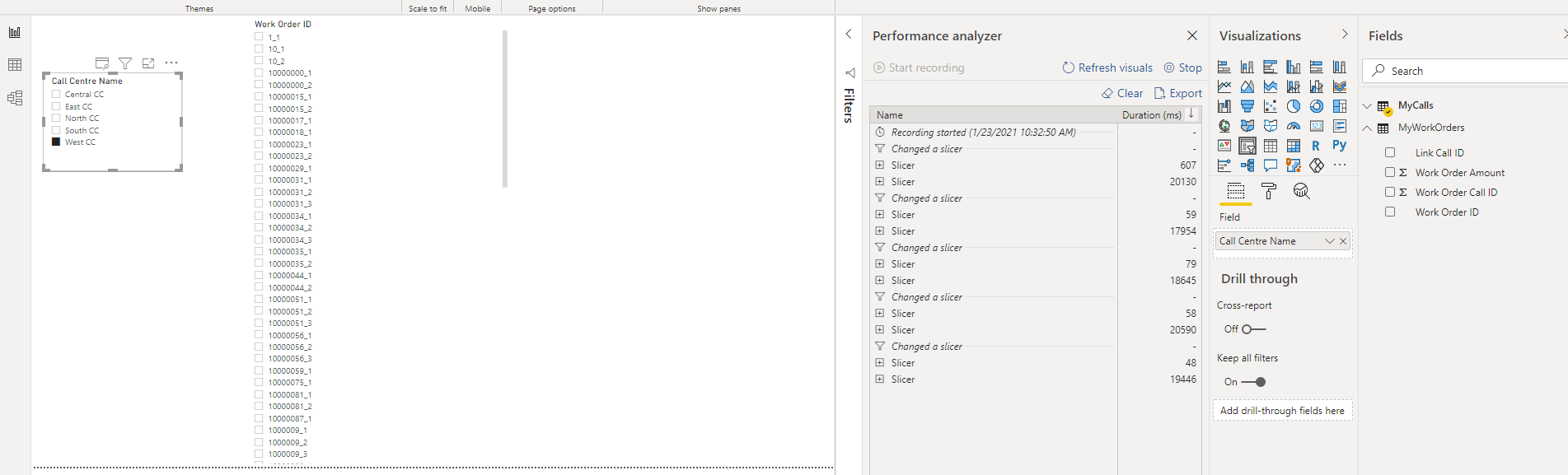
Overall, the median query performance for Power BI was approximately 19 seconds per selection, as shown below.
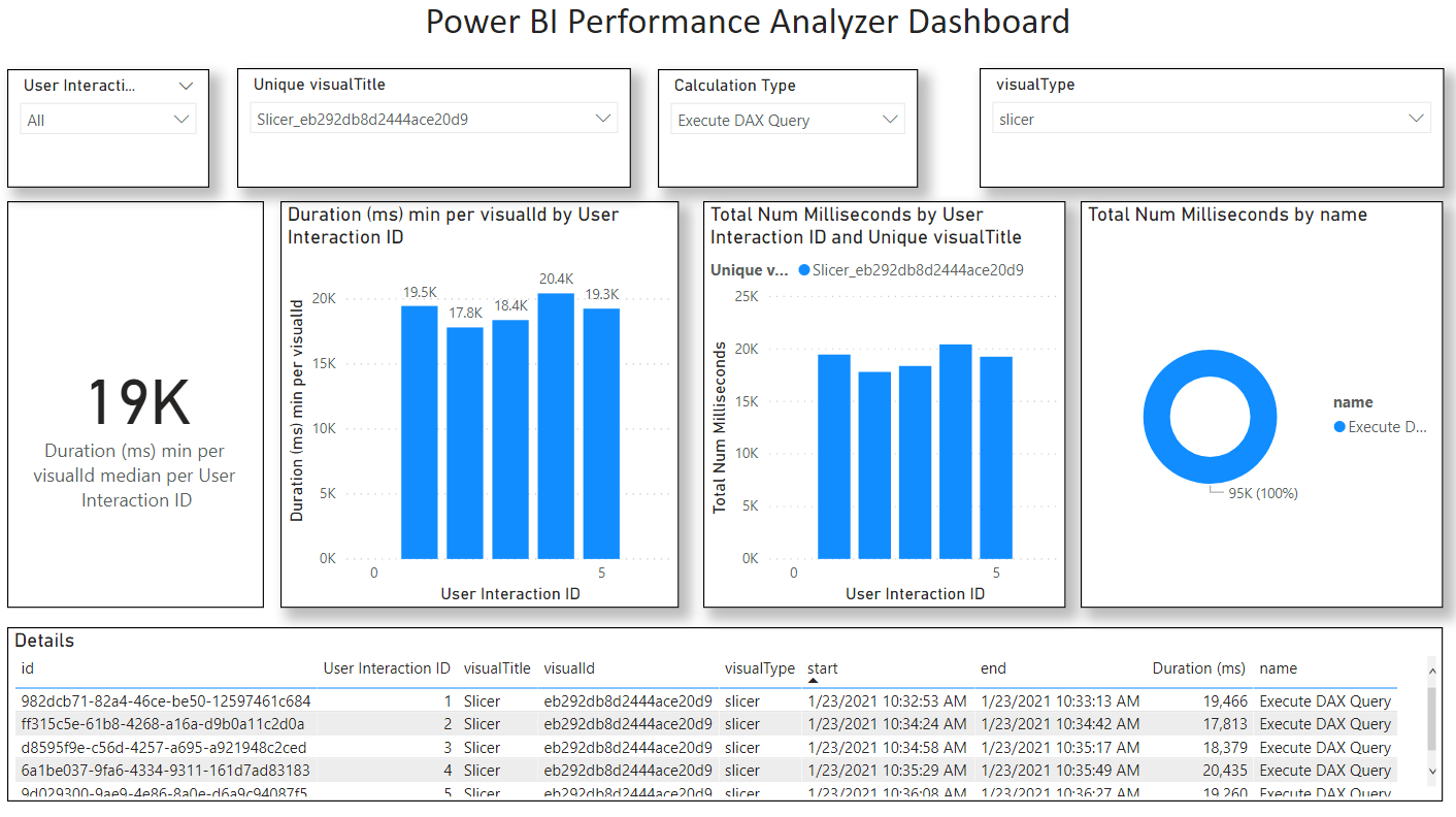
Here is the underlying JSON Performance data and a .pbix I used to analyze the data.
PowerBIPerformanceData_v1_Slicer.json
V1 Slicer Performance Analysis.pbix
With Qlik, I took different types of measurements (which are not possible with Power BI).
The table below shows measurements for an unsorted List Box with the same “Worker Order ID” field.
As shown in the table below we get a median response time of approximately 2 seconds.
Tool | Size | Selection | List Box Refresh Time (ms) |
Qlik | Huge | Central CC | 2,000 |
Qlik | Huge | East CC | 5,390 |
Qlik | Huge | North CC | 2,300 |
Qlik | Huge | South CC | 2,140 |
Qlik | Huge | West CC | 2,080 |
Median |
|
| 2140 |
But if you compare what is shown in the relatively quick unsorted display that QlikView is showing to what was shown earlier for Power BI, you can easily see the difference: Power BI is only showing the possible values, all sorted within the same block. But in QlikView, it’s effectively just highlighting the possible values among the originally sorted population.
You would have to scroll or glance through this list to see all the possible values which is obviously not practical with millions of distinct values. Although In some situations this is a helpful for making comparisons (typically when the list is short and can act like a visual heatmap), but in an example like this you would probably want to turn on both State and Text sorting which dramatically impacts performance.
Another thing you will notice if you look carefully is that it appears as though ‘10_1’ and ‘10_2’ (which are visible in Power BI) are missing from Qlik. If you were to scroll down the list you would find them. The reason they are not displayed is that what is being displayed in QlikView is the original sort order based from the load script. Often Qlik developers will pre-sort data before loading into Qlik for this reason – I did no such thing in this experiment, which is why some values appear to be missing when in fact they are just farther down the list.
I also took measurements when I turned on “State” filtering (whereby ‘possible’ values are listed above ‘excluded’ values) and I took another set of measurements when both “State” and “Text A->Z” filtering was enabled. The below table shows these in comparison with Power BI.
Tool | Test | Slicer/List Box Refresh Time (seconds) |
QlikView | No filtering, all values | 2 |
QlikView | Selection State filtering, all values | 15 |
Power BI | Text filtering, possible values | 19 |
QlikView | Selection State and Text filtering, all values | 25 |
Again, I must emphasize that the measurements shown above are not for apples-to-apples comparison between Power BI and Qlik, but they do reveal contours to the underlying indexing technologies which are key to the differences between the tools and to the business user experience, and ultimately to user outcomes.
In my next post I will explain why the differences in indexing technology between the two tools make an impact to Analytic Efficiency. But first let’s dive into the example that shows the mechanics of the indexing engines themselves.
Index Engine Walk-Thru
Before getting into this example, I will refer you back to my previous blog post which describes the data model. But to quickly recap, there are two tables: “My Calls” and “My Work Orders” and they are linked on a “Call ID”. Users select “Call Centre Name” from a Slicer or List Box and then see the total “Work Order Amount” aggregated from the “My Work Orders” table based on possible Work Order rows filtered indirectly by the “My Calls” table.
Now let us begin with our example walk thru...
Given our example of two tables: Calls and Work Orders, what is happening in Power BI when we select "Call Centre" = 'North CC' from the "MyCalls" table (using a Slicer) and then are presented with "SUM Work Order Amount" (from the "MyWorkOrders" table) in the form of a KPI Card?
Power BI (Vertipaq) Indexing Engine Walk-thru Example
Based on my reading of Microsoft and SQLBI's explainer presentations combined with my own experiences developing Power BI and Azure Analysis Services, here is what I believe is happening once a user makes the selection (feel free to correct me):
1. The cache is checked to see if this value has already been calculated. If it has been, then no searching or calculation is required, and the result can be shown instantly (constant time).
2. If the value has not been explicitly calculated by the cache, it may be possible to use previously cached results to speed up calculation time. For example, if the entire population of Work Order Amounts has a population of $5 and we can detect the presence of $5 while scanning the indexes, we can short-circuit the calculation because we already know it's not possible to find a smaller value. For our example here, only the MAX and MIN can be deduced in this manner, and we can see this in the test results.
Based on reader feedback to my last post, I suspect this is only happening when the DAX expressions are explicitly bundled together using the EVALUATE and SUMMARIZECOLUMNS functions taking advantage of “DAX Fusion” optimizations.
However, the Report developer would need to be aware of this, and if the Report has separate KPI Cards, then no such optimizations would take place (as of this time of writing).
3. Assuming the cache cannot help us (which is the true subject of our test), then the first thing we need to do is determine the rows in MyCalls that have been selected.
4. Power BI partitions data by default into 1 million row segments (Analysis Services partitions into 8 million row segments). Each segment in turn has its own Dictionary which allows the column values to be optimally compressed depending on the number of distinct values within the given segment. Since the MyCalls table has 100 million rows, we can expect approximately 100 segments (I say approximately because segment size is in fact 1,048,576 or 2^20 rows, since segments must be a power of 2). Based on simple calculation (100 million / 2^2 = 95.3), I estimate 96 segments and will use that number going forward.
Each of these 96 segments has its own Dictionary. The reason for having multiple dictionaries is that within in each segment only a subset of values is likely to occur. This allows for better compression and better compression allows for faster reads. Thus, each dictionary is consulted to see if it includes 'North CC'. Now if the segments had been aligned to this column we would only need to check a subset of segments. Depending on how the MyCalls table has been sorted, it's possible that Power BI is searching segments that only pertain to the 'North CC' call centre. This would mean querying approximately 20 segments (as opposed to all 96 segments).
5. Once all rows have been read (whether those rows are all lumped into a subset of segments or are spread across all segments), Power BI now needs to determine what linking keys are included in the selection scope. In our example the "Link Call ID" which is the field that links the two tables together is a whole number meaning that Power BI can more efficiently store as a compressed symbol without requiring a dictionary to decode the value which is more efficient.
6. Using the coded "Link Call ID" values, Power BI then determines how these linking values are mapped to the linked "MyWorkOrders" table using the "Relationship Index". In our example with 'North CC' being selected, the Relationship Index will point to a subset of segments in the "MyWorkOrders" table. Hopefully the tables are aligned, but it's possible they are not. Given that we have approximately 140 million work orders, we would have at least 134 segments. This would mean Power BI would need to scan at least a fifth of those segments (27 segments). That said, I suspect all MyWorkOrders segments would need to be scanned. The reason is that the MyWorkOrders table does not have a "Call Centre Name" column and only a "Link Call ID" column which does not share the same distribution as the Call Centre names. In all likelihood all 134 segments comprising all 140 million rows would be scanned.
7. As mentioned earlier, integer and whole number values are not by default "hash" encoded into a dictionary and thus do not require an additional lookup, so the values of the "Work Order Amount" can be determined directly from the compressed MyWorkOrders table.
8. From here Power BI is in the final stretch and using the "Relationship Index" can scan all the "Work Order Amount" column indexes for all rows in each of the segments that have the referenced "Link Call ID".
9. Power BI now calculates the Sum total of Work Order amount from these underlying values.
This leads us to the reasons why Power BI cannot easily query and calculate excluded rows (i.e the complement of rows):
- Only text and floating-point values are dictionary encoded in Power BI (whereas in Qlik there is no exception, all values are dictionary encoded since all values are of a 'dual' type and potentially hold both numeric and text values)
- PBI Dictionaries can be fragmented across multiple segments, requiring multiple dictionaries to be queried with results merged - a costly operation
- Through incremental partition refreshes, PBI dictionaries can contain values that are no longer referenced by any dictionary. Power BI even allows administrators/operators to perform a "defrag" on tables using XMLA commands.
- Power BI also allows for a DirectQuery mode that directly queries an RDMBS using generated SQL queries. DirectQuery is already challenged by latency to begin with, it would be even more challenging and time consuming to add additional queries to calculate the complement of a given column's values.
So how does Qlik (QlikView and Qlik Sense) work in this scenario then?
Qlik Indexing Engine Walk-thru Example
Based on my reading of Qlik's patent US: 10,628,401 B2 and experience working with QlikView and Qlik Sense, here is what I believe is happening once the user makes the selection.
I must warn you: Qlik’s engine is not as intuitive as Power BI’s Vertipaq engine and does not follow a “Columnar DBMS” architecture. For this reason, you can reference this document which contains the underlying example data I am referring to here.
Here is how it works:
1. Like Power BI, the cache is checked to see if this value has already been calculated. If it has been, then no searching or calculation is required, and the result can be shown instantly (constant time).
2. Qlik does not appear to use intermediate cache results (e.g. like the Max of the total population). If the result has not explicitly been calculated before it is entirely calculated without using past queries. Thus, caching in Power BI appears to be more sophisticated in this regard. Although I could be wrong here. But if you read the addendum to my previous blog post I present some evidence to support this.
3. Qlik takes the 'North CC' value from the user selection and looks it up first in the “MyCalls” BTI. BTI stands for"Bi-directional Table Index" which is a dictionary that points back to the row position of values. Already we can see that Qlik is starting with the dictionary before even looking at rows.
MyCalls Table | |||
Call ID | Link Call ID | Call Duration | Call Centre Name |
1 | 1 | 4 | North CC |
2 | 2 | 9 | North CC |
3 | 3 | 4 | East CC |
4 | 4 | 1 | East CC |
5 | 5 | 2 | West CC |
6 | 6 | 1 | Central CC |
7 | 7 | 4 | South CC |
8 | 8 | 9 | North CC |
4. The BTI points to all rows containing the value 'North CC' using what is known as a bitmap index. For example, if our MyCalls table had eight rows and the 'North CC' calls were on rows 1,2, and 8 then the bitmap index would look like this: 11000001, which in turn could be encoded into a single byte as 0xC3 in hex or 193 in decimal.
I want to pause for a moment and point out that it is here we can see a radical difference between how Power BI and Qlik index their data with respect to dictionaries.
In Power BI the dictionary is subordinate to the table rows and is not used for columns that contain whole and fixed decimal numbers, whereas in Qlik the dictionary is at the centre and the table rows are subordinate to the dictionary even when the column values are exclusively integers.
In other words, Power BI is more row-centric versus Qlik which is more dictionary-centric. It is this dictionary-centric approach to indexing which allows Qlik to efficiently query and present excluded values and thus present to the user those excluded values in Filter boxes (in Qlik Sense) or List Boxes (in QlikView). This is what Qlik's marketing refers to as "the power of grey".
5. Moving on with our example, once Qlik has determined which rows have values - using the BTI's bitmap index - it now needs to resolve "Link Call ID" values for the corresponding table.
6. Qlik then uses a second index known as an "Inverted Index" or "II" to look for the value symbol references for the "Linked Call ID" column. Using an example of our table with eight rows, our inverted index might look like this: 1;2;3;4;5;6;7;8
Each value in this single-dimension array corresponds to a given symbol value in the "MyCalls" table.
Given that we are interested in rows 1,2, and 8, we would need to reference Work Orders from the MyWorkOrders table with "Link Call ID" in (1,2,8).
7. We now take those three values and determine how the symbol value is mapped from the MyCalls table into the MyWorkOrders table. This is done through an index Qlik calls a "Bidirectional Associative Index" or "BAI".
8. Using the "BAI" we map the index position of the "Link Call ID" values (1,2,8) for the "Link Call ID" to the corresponding index positions. In our example, some (about 25%) of MyCalls records have no corresponding value in the MyWorkOrders table. So those "Link Call IDs" would map to the value '-1' to indicate the value does not exist in the linked table. The other values would have their values mapped. The following table shows how the values could be mapped for all Call IDs, assuming Call IDs 2 and 6 do not correspond to any "Linked Call Id" in the Work Order table:
MyCalls to MyWorkOrders BAI | |
MyCalls BTI Index | MyWorkOrders BIT Index |
1 | 1 |
2 | -1 |
3 | 2 |
4 | 3 |
5 | 4 |
6 | -1 |
7 | 5 |
8 | 6 |
At this point we should point out that Qlik would also build a corresponding index to go in the opposite directly. While that index would not be used in this example (since are going from MyCalls to MyWorkoders and not the other way around), it is worth showing how the other BAI would be constructed. Here is how it would look (keep in mind there are only six distinct "Linked Call ID" values in the MyWorkOrders table:
MyWorkOrders to MyCalls BAI | |
MyWorkOrders BIT Index | MyCalls BTI Index |
1 | 1 |
2 | 3 |
3 | 4 |
4 | 5 |
5 | 7 |
6 | 8 |
Please note: The above table is shown as an example of reverse linkage. However, for the remainder of this walk-thru we will NOT be referencing this BAI index. But we will be referring back to the MyCalls to MyWorkOrders BAI index.
It is important to note here that these link mappings are not linking from table to table, but rather from BTI to BTI.
It is through this BAI that Qlik is directly linking Dictionaries with one another.
It is as if the tables themselves don't really exist in any explicit format, the position of values within tables is essentially an attribute of the dictionary.
8. Now we have the BTI index positions of the selected "Link Call ID" values, Qlik can determine using what rows those values are found on using the BTI index for the given Call IDs.
In our example this means that Qlik would be looking up values (1,6) in the BTI for the "Linked Call ID" in the MyWorkOrders table.
MyWorkOrders BTI | ||
BTI Index | Link Call ID Value | Value Position Bitmap |
1 | 1 | 100000000000 |
2 | 3 | 010000000000 |
3 | 4 | 001101000000 |
4 | 5 | 000010100100 |
5 | 7 | 000000011010 |
6 | 8 | 000000000001 |
Using our example if we assume that the MyWorkOrders table has twelve (12) rows our bitmap indexes for "Linked Call ID" 1 and 6 would look like this:
1: 100000000001
6: 000000000001
Qlik then performs a bit-wise OR to produce the following bitmap index
1+6= 100000000001
A minor caveat: I mentioned earlier that a bitmap index is used by the Dictionary BTI to determine what rows the value falls on. However when the value is very sparse (I am making a conjecture here), I suspect the bitmaps are further compressed (probably using an offset and run-length-encoding). To be clear while I don't know for sure how the bitmap indexes are managed for sparse value distributions, it doesn't really matter all that much for the purpose of this example.
MyWorkOrders Table | ||
Work Order ID | Link Call ID | Work Order Amount |
1 | 1 | $15 |
2 | 3 | $10 |
3 | 4 | $20 |
4 | 4 | $15 |
5 | 5 | $5 |
6 | 4 | $10 |
7 | 5 | $20 |
8 | 7 | $5 |
9 | 7 | $15 |
10 | 5 | $10 |
11 | 7 | $5 |
12 | 8 | $15 |
10. Using the BTI for "Linked Call ID" Qlik locates all rows that we need to query "Work Order Amount" from using the "Inverted Index" or "II" for "Work Order Amount" might look like this:
1,$5
2,$10
3,$15
4,$20
3;2;4;3;1;2;4;3;3;2;1;3.
If we refer to the merged bitmap index above (using bitwise arithmetic), we can now use the II to determine that the values for "Work Order Amount" are: 3 and 3.
From the above example, we can see the BTI for Work Order Amount might look like this:
11. Qlik can now determine that since both references are to row 3 in the BTI, it can more efficiently calculate the SUM of Work Order Amount by multiplying the value by the number of instances. This would be 2 * $15 = $30.
12. Qlik now presents back $30 as the total back to the user.

